Do you care about Lightsources and shading position

BAN_KAI

Artist
上級員 / Jyoukuuin / Sr. Member
Joined
Sep 21, 2009
Messages
297
Reaction score
91
Age
38
Gender
Male
Country
Bosnia and Herzegovina
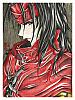
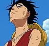
Just made this, took me an hour, it was a lineart that i used without the background so i colored the back as well.

In the V1 i used 1 gradient idk but for me it looks better

V1


V2


So i need you opinion, when you look at somebodies colorings do you think about where the shades should be or even the shapes of the shades , then highlights ? , cause i just cant explain to some people that not all people color in the same way.

So do you ??'​
 

Hand Banana

Registered User
上級員 / Jyoukuuin / Sr. Member
Joined
May 2, 2009
Messages
466
Reaction score
113
Gender
Hidden
Country
Antarctica
NarutoGoku was right. Light source on a person really brings out the picture. Without it the picture looks flat and dull. It took me a while to learn it but it really makes the picture stand out
 
  • Like
Reactions: nat

-Ren Boy-

Registered User
有名人 / Yuumeijin / Celebrity
Joined
Mar 22, 2009
Messages
2,679
Reaction score
700
Age
33
Gender
Male
Country
United Kingdom
Also the picture will look more realistic than say if you were to apply shadows which condradict over shadows.

P.s why do you persist on adding filters on top of your work without no meaning to it, sorry but I don't like when you do it.(v.1)

Also colour it to the line so there is not white dots in the lines, just try make it neat.

But the rest I like, you did good in the time you said :D
 

Aldoor

Registered User
中級員 / Chuukyuuin / Member
Joined
Dec 23, 2008
Messages
181
Reaction score
29
Age
36
Gender
Male
Country
Israel
I like your coloring, except for the mouth. Moreover, you really have problem with the lineart. (I like V2).
 

Poppet4439

Registered User
初心者/ Shoshinsha / Beginner
Joined
Sep 7, 2009
Messages
38
Reaction score
3
Gender
Female
Country
United Kingdom
Version 2 is better BUT!
work on the lineart a bit, cus you can see some white dots really close to the line,
on the right hand side where his hair ends the background isn't colored properly,
by the ear there is white patch which suppose to be hair,
where the red patch thing is on the shoulder there is some red on the jumper,
and there is some blue near the mask on the green thing, same under the shoulder.

apart from those points above the colors are great and matched together,
and if you work on your style a bit you wont even need to use lineart cus it looks so realistic :D keep up the good work.
 

toni783

Registered User
上級員 / Jyoukuuin / Sr. Member
Joined
May 28, 2009
Messages
494
Reaction score
97
Gender
Male
Country
Venezuela
i agree whit all the people here the Lightsources and shading position are something that you must learn if you want to make great works , it doesn´t have to be 100% realistic but it have to make some sense , its like you can´t put the Lightsource and shadows in the same side and all that stuff, i like how you did the shadows and Lights in this BUT the lines more work too if you put them better the work looks 100% better XD hope it helps
 

BAN_KAI

Artist
上級員 / Jyoukuuin / Sr. Member
Joined
Sep 21, 2009
Messages
297
Reaction score
91
Age
38
Gender
Male
Country
Bosnia and Herzegovina
Also the picture will look more realistic than say if you were to apply shadows which condradict over shadows.

P.s why do you persist on adding filters on top of your work without no meaning to it, sorry but I don't like when you do it.(v.1)

Also colour it to the line so there is not white dots in the lines, just try make it neat.

But the rest I like, you did good in the time you said :D
Thanks,well for me i like more the coloring with filter effects dont know why :tem

Version 2 is better BUT!
work on the lineart a bit, cus you can see some white dots really close to the line,
on the right hand side where his hair ends the background isn't colored properly,
by the ear there is white patch which suppose to be hair,
where the red patch thing is on the shoulder there is some red on the jumper,
and there is some blue near the mask on the green thing, same under the shoulder.

apart from those points above the colors are great and matched together,
and if you work on your style a bit you wont even need to use lineart cus it looks so realistic :D keep up the good work.
ROFL and have you noticed that in just 1 look cause i wouldnt if you didnt said that :D well majority of my colorings are not finished, i could color them for hours but i dont feel like it and i upload it ,and thanks i apreciate it .

i agree whit all the people here the Lightsources and shading position are something that you must learn if you want to make great works , it doesn´t have to be 100% realistic but it have to make some sense , its like you can´t put the Lightsource and shadows in the same side and all that stuff, i like how you did the shadows and Lights in this BUT the lines more work too if you put them better the work looks 100% better XD hope it helps

THanks it helped a lot, just wanted to see if other members pay attention where the shades and Lightsources should be .
 

- aMt -

Artist
有名人 / Yuumeijin / Celebrity
Joined
Aug 20, 2008
Messages
3,093
Reaction score
517
Age
32
Gender
Male
Country
Brazil
your need improve... the version 2 is so good =D

but the pallete is bad ^^
 

QianQian

Registered User
中級員 / Chuukyuuin / Member
Joined
Jun 22, 2006
Messages
138
Reaction score
44
Gender
Hidden
Country
Canada
The position of the shade does not change. You can be creative with the shape, and do whatever with the color.
 

KnuckleheadedNinja

Registered User
MH中毒 / MH Chuudoku / MH Addicted
Joined
Nov 25, 2007
Messages
5,576
Reaction score
2,079
Gender
Male
Country
Nigeria
Nice works. I prefer V2 more.
 

Lee-tyme7

Registered User
英雄メンバー / Eiyuu Menbaa / Hero Member
Joined
May 5, 2009
Messages
963
Reaction score
219
Gender
Male
Country
United States
umm...for me v2 looks better cus of the colors. I just don't like the contrast on V1, it looks like some one copied it right out of the copy machine...sorry.
 
Top