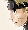
[422][14] Kakashi panel!

Jiraya

Registered User
下級員 / Kakyuuin / Jr. Member
Joined
Jun 28, 2008
Messages
60
Reaction score
23
Gender
Male
Country
Poland
That is it:
 

Toobi

Registered User
英雄メンバー / Eiyuu Menbaa / Hero Member
Joined
Sep 17, 2007
Messages
647
Reaction score
71
Gender
Male
Country
Colombia
nice papel
 

lee-nus

Artist
英雄メンバー / Eiyuu Menbaa / Hero Member
Joined
Jan 4, 2006
Messages
1,902
Reaction score
611
Age
42
Gender
Male
Country
Sweden
to quote the thread maker: "Sorry, but it's ugly ;( read tutorials"
:)
 

Toobi

Registered User
英雄メンバー / Eiyuu Menbaa / Hero Member
Joined
Sep 17, 2007
Messages
647
Reaction score
71
Gender
Male
Country
Colombia
i think that he tried to tell you that you should put more shadows and effects on your work, and for that you should read some tutorials, try looking for a picture of anime that has the same illumination, then you'll know where you have to put the shadows...:amuse
 

Jiraya

Registered User
下級員 / Kakyuuin / Jr. Member
Joined
Jun 28, 2008
Messages
60
Reaction score
23
Gender
Male
Country
Poland
i think that he tried to tell you that you should put more shadows and effects on your work, and for that you should read some tutorials, try looking for a picture of anime that has the same illumination, then you'll know where you have to put the shadows...:amuse
Yea, i understoond him, but my wqork is much better then this shit;
http://hari-jizo.deviantart.com/art/Omoi-101723531
 

Jaime F.

MH Senpai
英雄メンバー / Eiyuu Menbaa / Hero Member
Joined
Sep 12, 2007
Messages
2,227
Reaction score
166
Gender
Male
Country
United States
I'd be a little more modest if I were you, even if it pains you to do so. The colors Hari-Jizo used to color Omoi, are very tacky, and look like the color of plastic toy balls, but the actual coloring skills between the 2 of you, aren't vastly different. I commend you for trying, and not useing annoying colors, but first off, the lineart in your coloring is kind of sloppy, especially the shape of Kakashi's sharingan. Having a good quality cleaned panel of lineart, will actually help a lot with making your colorings look better in the end, so keep that in mind before you start a coloring. Another thing I noticed, is that the shadows on Kakashi's face look kind of out of place. Since you're at a novice level, you're bound to make some mistakes, so the best thing you can do is, learn from those mistakes when you make them. If you fail to learn from you own mistakes, you might not improve as quickly as you want to, so it's best to be modest in the beginning. Well I hope you know my intentions are good, and that I'm just trying to help you out. Some of what I said may seem a little bit harsh at first, but I'm talking from experience, so please take my criticsm's in a positive manner. If you keep practicing this style of art in a dedicated way, then you'll start to progress for sure.
 
Last edited:

Toobi

Registered User
英雄メンバー / Eiyuu Menbaa / Hero Member
Joined
Sep 17, 2007
Messages
647
Reaction score
71
Gender
Male
Country
Colombia
Yea, i understoond him, but my wqork is much better then this shit;
http://hari-jizo.deviantart.com/art/Omoi-101723531
hey you can't insult the work of the people, you only have to effort to be better colouring, don't be Aggressive just read some tutorial and dedicate more time to your works...
de hecho... the "shit" put more effects than you and the texture that he used is really nice:amuse don't be jealous, just practice man, "nobody born knowing"
 
Top