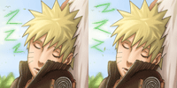
~Naruto Ch.322 Cover~ By Googlez_kun

Googlez_kun

MH's Best Artist
九千以上だ! / Kyuusen Ijou Da! / It's Over 9000!
Joined
Oct 22, 2008
Messages
9,744
Reaction score
8,510
Gender
Male
Country
Germany
Here you go: http://hari-jizo.deviantart.com/#/d2u1pem


As HulkArrogance suggested i tried to do a happier coloring and since the new chapter is still not there,i thought i should post it.

It's quite an old cover,but i like those characters.^^

I'll reply later,because i don't have much time...

Naruto(C)Kishimoto Masashi

Lines and colors by me.:)

Enjoy!:toc​
 

BAN_KAI

Artist
上級員 / Jyoukuuin / Sr. Member
Joined
Sep 21, 2009
Messages
297
Reaction score
91
Age
38
Gender
Male
Country
Bosnia and Herzegovina
i liked your old colorings a lot more, these last 3 colorings you made with the same texture are kinda messy
 

- aMt -

Artist
有名人 / Yuumeijin / Celebrity
Joined
Aug 20, 2008
Messages
3,093
Reaction score
517
Age
32
Gender
Male
Country
Brazil
WOw this is amazing ;O
-
Like so much the pallete and the contrast ;D and the blue on all LOL
-

I think you should not use the same color to the skin of both. Hardly two people have the same skin color.

Good luck to next job
 

Googlez_kun

MH's Best Artist
九千以上だ! / Kyuusen Ijou Da! / It's Over 9000!
Joined
Oct 22, 2008
Messages
9,744
Reaction score
8,510
Gender
Male
Country
Germany
i liked your old colorings a lot more, these last 3 colorings you made with the same texture are kinda messy
I can't really follow you here,especially in this coloring you barely see it.
And i also used this texture in older colorings....
WOw this is amazing ;O
-
Like so much the pallete and the contrast ;D and the blue on all LOL
-

I think you should not use the same color to the skin of both. Hardly two people have the same skin color.

Good luck to next job
Thank you so much man.

And thanks for the useful advice!:thumbs
 

Arrogance

MH Senpai
MH中毒 / MH Chuudoku / MH Addicted
Joined
Jun 5, 2009
Messages
5,080
Reaction score
2,366
Gender
Male
Country
United States
Wow its still really amazing. Everything pops out with color!...almost too much at time :oh......:p. Its still really good. Yea I think darker is more your style and your pull it off a bit better but you need to practice everything and at least try ;). I would like to see more of both darker and more colorful styles from you. I think in this the background is colored the best and looks great brighter but for some reason your characters seem a bit too fake and popping out. The colors are great but there is almost a bubble effect to them in which they look unreal and pop out of the picture in an odd way. I think what you wanna do is keep the color but make it seem more realistic.
 
Top