Laptop is by my bro in law and i'm not sure if he backed up any of my files. If he didn't, can I submit my current sig if I don't get time to make another one?
They all look very nice. The first three signatures look more like your usual style of crisp images with sharp color contrasts. Usually animated signatures don't come out that well because of the 300 KB image size restriction, but those gifs still look like they have good quality. I look forward to whatever you decide.
So, just to be clear, everyone thinks that they can get their submissions in by this Saturday then? This means that the deadline remains the same.
Re: All Purpose Sig Contest Discussion Thread 2010
I thought I was going to skip this one, but seeing that there was no entries I made something really fast and just submitted it. It's not that great, but an ok result for how little time I spent.
@ Cofee - Out of the light sigs you posted I like the third one the best and then the colored animated one. The animation is really cool, but I like the overall look of the third sig better, it looks more professional. Too bad about the size limits, or you could add an animation to the third sig.
PS - Sorry I spelt you name wrong.
Re: All Purpose Sig Contest Discussion Thread 2010
Ya, The idea for the animated ones is a good one, I just plainly couldnt use a more detailed render due to the size limit, and even those previews there would have had to been worked on a little more to shrink it down a bit~
Im about to turn in my sig, just give me a few minutes.... something odd went down~
I added some more touches last night and saved it as HikariBall5.png
I log on today and go to upload it and its nowhere to be found... I thought maybe I misplaced it into a random folder, so I do a search and I find it in the Recent Files area..... but only the shortcut... weird, the original file doesnt exist anymore...... the PSD still is saved though... how odd~
Re: All Purpose Sig Contest Discussion Thread 2010
I'm in a hurry right now!
I could submit my marco sig! I'm currently working a Daft Punk x Tron Legacy sig for the light theme but I won't finish it in time.
Alternatively, I could use one that I have stored as back up ready to submit!? What shall I do!!!!!!!!!!!
Submitted my Light-themed sig!
A bit late but..THANK YOU SO MUCH TO ALL THOSE WHO VOTED FOR ME! I'm so happy that many of you liked my Fashion-sig!
@ Tsuki - Please continue as you were in regards to presenting winning pieces, complimenting them, etc. Your "commentaries" are very entertaing to read and greatly increase the overall entertainment and fun when it comes to these bi-weekly sig contests.
@ Coffee - Bwahahahahahahaha!
I Won! YOU Lost!!! It's 3-3 AGAIN!
Sorry, I just couldn't help myself. I had to get that off my chest.
Re: All Purpose Sig Contest Discussion Thread 2010
I am a little disappointed to see that there are only 4 submissions in the light sig contest. I like to usually have 5 submissions as a minimum for closing a contest, but since this might be a busy time for everyone (and the lack of enthusiasm about this contest, evidenced by the first submissions coming only at the very last minute ), I will end it once it has been a full two weeks. So, you still have a little less than an hour and a half if you still want to submit!
The new contest is up, and it is another holiday-inspired contest. The theme is good. The reason for the holiday season is all about celebrating the good in our lives and the world, and this theme is an homage to that. Your submissions should be about something you consider good. I hope this theme helps you all get further into the holiday spirit (and I also hope that there is a bit more participation with this contest as compared to the light contest )! Enjoy!
Re: All Purpose Sig Contest Discussion Thread 2010
I'm so glad you guys submitted sigs!!! I was worried that my thrown togther entry would be the only one.
@Tsuki - I also enjoy your commentaries on the winning sigs, they are most amusing. It's too bad about the small number of Light theme entries. I really liked the theme myself, I think it's just a busy time of year, I wish I had taken the time to plan something more original. IMO the new theme is much harder. It will take some thought to come up with something that clearly fits the theme in meaning and illustration.
Re: All Purpose Sig Contest Discussion Thread 2010
I am glad you liked the theme, DeBaron8, and I would not have known that your submission was thrown-together if you had not said anything. It looks quite good!
I also liked the light theme and thought that it might inspire a lot of interesting choices. I was a tad surprised to see Bugzee choose to do a submission based around Marco since Kizaru seemed like a more natural choice for this contest if one were to use One Piece.
Voting for the light theme is now begun! Which signature shines brightest? You decide! You have a week to caste your vote for your favorite!
A bit late but..THANK YOU SO MUCH TO ALL THOSE WHO VOTED FOR ME! I'm so happy that many of you liked my Fashion-sig!
@ Tsuki - Please continue as you were in regards to presenting winning pieces, complimenting them, etc. Your "commentaries" are very entertaing to read and greatly increase the overall entertainment and fun when it comes to these bi-weekly sig contests.
@ Coffee - Bwahahahahahahaha!
I Won! YOU Lost!!! It's 3-3 AGAIN!
Sorry, I just couldn't help myself. I had to get that off my chest.
- I also liked your sig a ton, the only thing that stuck out to me was the umbrella was falling apart and I didnt like that for some reason~ otherwise it was epic~ A deserved win
On Another Note -
It was this close = | | to being a tie ~ XD
I was up visiting family in a different city when the voting was going on and one of my family members happens to have an account here and she sat down to vote for me, then as silly as she is, forgot her password... T_T ... then she got too busy baking pie and stuff for a christmas party the next day, LOL
I have yet to see a tie happen during the time Ive participated~
and @ Tsukisama, your comments are always good to hear (for the people who win) but Im curious. You said that you used to comment for each entry but I dont remember that, so it must have been before I showed up correct?
(I usually also like to read your colorful descriptions of the New Theme)
and a quick question -
I just now used a XP machine to look at the sigs, and mine doesnt look even close to the same... T_T
Re: All Purpose Sig Contest Discussion Thread 2010
I actually had ideas for the light theme, but was too lazy because of me finishing my undergraduate course :x
I also really like tsukisama's comments and descripitions of the themes, they motivate me in a way n_n
the new theme really fits this time of the year, as the idea of "being a good boy/girl" to receive Santa's presents...
Coffee, I don't really think that's related to the os we're using... my computer at home is win XP, and at university and work I use mac os x and win 7... I usually check MH there too and I don't see a difference... that's probably because of the way the monitor is calibrated (the ones I use I always check bright, depth, etc, so the designs I'm working on always match when in different machines and also match the printed version)
And yes, I can see the background of your sig and even the lines of the extrusion you used in the letters...
Re: All Purpose Sig Contest Discussion Thread 2010
Oh~ Well now I feel stupid~ lol, I always assumed there was a difference between operating systems when it came to display as in I usually saw a brightness difference. (Further confusion is caused by Photoshop having a function to preview works in difference OS's) - Ill have to research into it a little bit~
Anyways what caused me to ask is that I checked it out on a XP machine and (even after changing the monitor settings) it was so dark that I couldnt see the background lighting, the 3d-ish area of text or the outer area of the render....
Re: All Purpose Sig Contest Discussion Thread 2010
It's a good thing that people submitted their entries before the deadline even if there's only 4 signatures.
Nothing was wrong with the theme, it's just that people were busy.
Also, I would like Tsukisama to keep commenting on the signatures as he usually does. It makes the contest better.
My signature wasn't that great, I know. But I prefered to submit something instead of sitting out a contest I hope you don't hate the sig as much as I do.
I also liked the light theme and thought that it might inspire a lot of interesting choices. I was a tad surprised to see Bugzee choose to do a submission based around Marco since Kizaru seemed like a more natural choice for this contest if one were to use One Piece.
I initially made that Marco sig to submit for the fire-themed contest but unfortunately I missed the deadline so I had no choice but to store it on my comp hoping for a chance to reuse it either for a future sig contest or just give it to someone to use as a sig or something. Luckily for me, the light-themed contest paved the way for me to take advantage of my uber-smexy and zomg-epic-like Marco sig.
Seriously though...I was working hard on a Daft Punk x Tron Legacy sig which you can see below:
I just didn't have enough time to finish it before the deadline tbh. Neither did I feel comfortable or happy with it at the time for me to just submit it in anyway. So for now it's "on hold" xD.
- I also liked your sig a ton, the only thing that stuck out to me was the umbrella was falling apart and I didnt like that for some reason~ otherwise it was epic~ A deserved win
Hey Coffee! Thanks. I'm glad you liked it a lot. ^^
There's always a catch...I don't see anything wrong with it. I purposely created an outer line/glow (in black) between the kimono girl render and the rest of the sig background. I prefer adding a bit of a rough look to all my sigs. It doesn't have to be the focus or the main aspect of my sig but crystal clear pictures/patterns/sigs are just not my kinda thing. They get boring after a while. This isn't an insult btw towards you, Coffee.
The ideas you use in conjunction with your super clear renders are always awesome and *.*! I honestly think you could've done a lot better for the light-theme sig though. Take it up a notch!
On Another Note -
It was this close = | | to being a tie ~ XD
I was up visiting family in a different city when the voting was going on and one of my family members happens to have an account here and she sat down to vote for me, then as silly as she is, forgot her password... T_T ... then she got too busy baking pie and stuff for a christmas party the next day, LOL
I have yet to see a tie happen during the time Ive participated~
Cheater! *We need to update the rules of this contest. *
T'is an awesome contest.
It's ashame kakashi didn't submit anything this time. He spends way too much time now in the Fun Forum just spamming away~ Seems like darkdana666 is gone! T_T nanaD is just being too lazy these days. I wish she could submit something every week because I really like her ideas.
It's a good thing that people submitted their entries before the deadline even if there's only 4 signatures.
Nothing was wrong with the theme, it's just that people were busy.
My signature wasn't that great, I know. But I prefered to submit something instead of sitting out a contest I hope you don't hate the sig as much as I do.
That's one of my favourite sigs of yours, Shin! White, black and green! Great combination of colours and the background has been superbly done to bring out that splinter cell picture.
Unlucky dude. At least you're NOT THAT lazy and you're still able to submit and post around here. I wish you the best of luck for your up and coming exams, Shin!
Re: All Purpose Sig Contest Discussion Thread 2010
@ Coffee - About your sig looking different - It's definitely different monitors, their callibration and graphic cards that make the difference. I can see the bakgorund nicely on my destop, but it's harder to see on my laptop. I have the same problem all the time, b/c I never know what my sigs look like for others - usually not quite the same as I see them. I have access to three computers, and my sigs always look different on each one, so it's hard to decide which version to submit. I find the difference between my laptop and destop the most extreme and both have Windows 7, my really old computer with Win XP and a CRT monitor usually looks somewhere in between the two. That's why I try to avoid making sigs and art on just the laptop screen, b/c they always turn out weird, sadly I couldn't avoid it this time around, but I think it's one of my better laptop creations.
It's ashame kakashi didn't submit anything this time. He spends way too much time now in the Fun Forum just spamming away~ Seems like darkdana666 is gone! T_T nanaD is just being too lazy these days. I wish she could submit something every week because I really like her ideas.
yes, I was... I admit it Ç__Ç
I kind of feel ashamed now... even tough I still think I deserved a period of laziness after my grad work...
but yesterday my vacation time started and I'm already making lots of things again... currently, I'm finishing a comic strip for a contest... and I still have 30 pages to draw/ink/color plus 10 to color of a story I started this semester... I also have a website to develop as a freelance work... and I started doing some drawings for myself... oh god ._.
Re: All Purpose Sig Contest Discussion Thread 2010
@Bugz - I wasnt being lazy lol my PC is still down and laptop hasnt come back yet, so I have no way to make any sigs right now. Can only post with my psp
@Shin - I like the idea of your submission, but I think it would have been better with a dark background.













 Good luck to everyone






 I'm currently working a Daft Punk x Tron Legacy sig for the light theme but I won't finish it in time.
 I'm so happy that many of you liked my Fashion-sig!
 )! Enjoy!
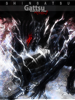


 *We need to update the rules of this contest.


