Re: All Purpose Sig Contest Discussion Thread 2011
Congratulations, Coffee \o\~~~
people were really early on this one... even before tsukisama @__@
though I guess im missing an I in hoshii
When I first read I was about to say it... "hoshii" indeed n_n
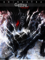
IMO, The first version effects were better Kakashi.
The lightning you added doesn't fit with the rest of the colors and it seems that every render has it's own aura now...
I suggest you to follow the same steps you did in your very first attempt and try to play with the background image you found.
I agree here... it seems that in the new one the background was much more important... the two sigs are really good... I just prefer the first one...
It's already on my list, but I was unsure whether or not to use it as some might see it as too close to the "baby" theme, which did not get very much participation. I shall reconsider it now though.

eeeh... for me baby and chibi are quite different themes...
I just worked on that Ashita sig I shared earlier, but I feel I may have just beaten it to death and may need to start over completely yet again. I know what I want, but I cant seem to get photoshop to match the image in my head~ Ill share the progress with everyone tomorrow~
this kind of thing is frustrating, isn't it? I have several versions of my works... each one in different stages so I can go back to were I think it can lead me to better result...
but I have faith in you, coffee... waiting for another great sig n_n