

- Joined
- Feb 1, 2010
- Messages
- 2,115
- Reaction score
- 1,176
- Gender
- Female
- Country
-


Re: All Purpose Sig Contest Discussion Thread 2010
about the saber sigs, debaron pointed out the blur for a perspective effect... I think that because there's no blur in the sword the perspective sense gets a little lost, maybe that's why it standed out... there're two focal points... about the details on the hand I won't comment because I'm not sure of what I see @__@
(monday morning my computer will get a check up... finally)
ehh interesting themes...
hmm... I haven't tried to do a gif with cs5... upgraded this year from cs3... I'll make some experiments...Ya Ive also noticed with Photoshop CS5, (and CS4?) that since they have their own built in animation options, that the output is always extremely lossy when saving it as a Gif. Back in CS3, which I have on my desktop system, when you wanted to animate it would export the image over to a different program (ImageReady) and you could save a lot of the data, though of course, keeping it at a large file size.
about the saber sigs, debaron pointed out the blur for a perspective effect... I think that because there's no blur in the sword the perspective sense gets a little lost, maybe that's why it standed out... there're two focal points... about the details on the hand I won't comment because I'm not sure of what I see @__@
(monday morning my computer will get a check up... finally)
ehh interesting themes...





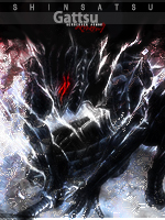







 looks cool. But for some reason, it seems to me that color isn't suited for this manga lol. It just looks epic in black and white.


