Ah, I finally got an idea and now I don't think I'll have time to make it. There is a big lightning storm coming so I'm going to have to unplug all my electronics for a while. -_-
I'm also surprised by the lack of entries, where are all the people who entered last time?
Seems like it might have been a semi difficult theme to grab ideas/motivation for~
This was mine that I was working on, but I ended up going overboard and I felt like I might have beaten it to death so I went with the Simple Animated one instead =
Yeah... I am also a little dismayed by the shortage of entries. I hope it is not the theme as ~Coffee~ suggested. If it is or some other reason, please share, if you don't mind, because I would like to make the contest as fun as possible for you.
Given the lack of a sufficient number of entries, I'll extend the contest by one week in the hope that more submissions arrive. (On the bright side, this gives you the opportunity to submit, DeBaron8! ) Here's hoping that some more come in this one additional week.
Your new submission change is totally fine, ~Coffee~, and I altered your post for you. I have been very busy with some personal affairs recently and so had not checked this thread. I'm sorry for not noticing it until now.
For future reference for anyone, one of the best ways to get a more immediate response on issues like these is to send me a PM mentioning the nature of the concern in the title. Even if I am really busy, the first thing I do when I come online is check my private messages, but I usually am much better about checking this thead than I have been this past week.
With ~Coffee~'s new signature now in place, submission for the dance sig contest is complete. Of the four fine entries, which one has danced it way into your heart? Cast your vote for your favorite terpsichorean signature within one week's time.
Originally, I had scheduled a very different, potentially somewhat challenging theme for this week, but given the lower participation in this past contest, I think that it might be best to go with a very straightforward theme. Thus, the new theme is sand. Sand has been used in tons of various media to the point where you should be able to glean a wide assortment of ideas for the theme, ranging from beaches and deserts to the sands of time and the sleep-inducing sandman among many other ideas. Take a page from the oyster and turn a grain of sand into a precious pearly thing of beauty!
@ Coffee - I like the water, it may not be 100% realistic, but it looks really cool.^^ I'd say the sand needs more work, it could have some more texture and shadows on it. I also feel that the whole canvas is not being used, maybe try to crop it? idk though. Overall I like the concept, it's a good way to take on the theme.
Yes, thank you debaron, I also think that the sand doesnt have enough texture and depth to it, I worked on it a little bit, but I gave the water most of the attention, but this is only 1 night of working on it, so Now I shall concentrate on giving the sand a bit of 'deepness' if you will~
I think the water's a little too blue or it's just too bright. But it's probably supposed to be like that with the sand color that bright. Good idea for the sand theme; I also thought of doing a beach. My first idea was Gaara, but meh...^^'
I also first thought of Gaara, but that was probably because just that morning I had finished a sig request for someone that was centered around Gaara, Interesting Coincidence~
On my breach sig there, I also (today while reading Berserk and saw a beach scene) realized that Im missing WET SAND.... sighhhh
Yeah, I thought of Gaara too, as well as The Prince of Persia games. I hope I get time to make an entry.
Could I get some CnC on this sig? This sig didn't turn out that good...but Idk why. :S I made it b/c I realized I never made a Gaara sig before and I really wanted to, but I thought the idea wasn't quite unique enough for an entry.
As for your sig, baron, I think it would be best if Gaara crying got more of the focus than the other pic. Try moving Gaara more to the center and make the other pic smaller so it attract less attention. Making it a less unsaturated might help get rid of the focus.
I never thought of PoP; good idea! I might do Gaara since I haven't made one of him for a while.
@ Gintara- Thanks for the feedback. XD I agree with both of your points. I couldn't really move the Gaara stock since it ended at that point. I think that was the fatal flaw to the sig. And the other image should be smaller, I made it smaller a few times, but I got too laze to take it farther b/c the image was very short. Although now I wish I had done it, it takes too much focus away from Gaara. -_- I might try unsaturating it like you said.^^
---------- Post added at 04:38 PM ---------- Previous post was at 04:06 PM ----------
The first thing I notice is that the background image (and its artistic grain) are going in a diagonal direction, while the text is horizontal and Older Gaara is vertical~
@ Coffee - Thanks a lot for the feedback. You explained that so well. XD You should be a teacher. I see exactly what you mean, no wonder I thought there was no flow. I have vertical, horizontal, and diagonal lines. -_- Do you think it would be better if I made the diagonal lines a vertical and horizontal cross-hatch? Or just horizontal or vertical scan lines?
And I'm glad youy think the lighting is good.^^ I had no choice but to put it there since there was a huge bright spot on the Gaara render. I tried my best to pull it off, so I'm very pleased to know it looks decent.
Im thinking I would either make at least 1 of the directions less noticeable (such as lowering the opacity of the background a little)
or
- Tilt the one of the 3 (text, background, old gaara) so that theres only 2 directions
- Just thought of this - - - but if you Duplicate the old gaara render, add either a directional blur (or better yet an artistic filter) to it and then change its blending mode~ You could add a diagonal grain to the render without having to tilt it.
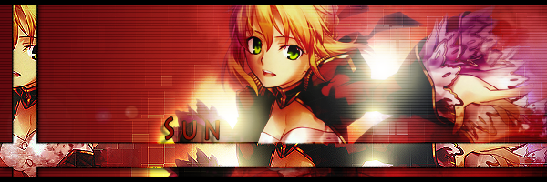
- I always like when people work it out where the lighting works with the text as well~ (Like my Current Sig, "With The Sun")
How is this looking now?
I added a little extra dimension to the sand, some wet sand, fixed the water and the water color a little, added a bit more sand around the text~
Sorta hard to change much anymore considering theres a lot of applied image layers, but I may try to add in some more waves if it looks good~










 There is a big lightning storm coming so I'm going to have to unplug all my electronics for a while. -_-