Art Art Evolution

Organizized

Pirate King in the North
有名人 / Yuumeijin / Celebrity
Scavenger Hunter Supreme
Joined
Nov 5, 2007
Messages
4,334
Reaction score
22,333
Gender
Male
Country
Sweden
One of the most extreme examples that comes to mind is Vinland Saga. It might be partly due to Yukimara's moving from a weekly to a monthly magazine, but damn did his art improve as the series went on. I mean, the amount of detail he puts into it now compared when the series started is ridiculous.

Example:


R4n

Registered User
英雄メンバー / Eiyuu Menbaa / Hero Member
Joined
Sep 16, 2009
Messages
917
Reaction score
208
Gender
Hidden
Country
Micronesia
When i read Vinland Saga from chapter one to the latest chapter i completely didn't realize the art evolution at all. I guess that is because the storyline is too engaging. :D

The change is very impressive indeed.

P.S. i am very grateful it change publication from a shounen magazine to seinen magazine.
 
Last edited:

Kaiten

Harasho
神のごとし / Kami no Gotoshi / Godlike
Joined
Aug 20, 2007
Messages
27,293
Reaction score
15,166
Gender
Hidden
Country
Abu Dhabi
I hadn't noticed either :XD

Looking back I can see a huge difference when he switched to Afternoon. That was a demographic switch too.

D.Gray-man has changed a lot too, especially since Hoshino sensei went monthly. I personally liked her art better from around chapter 70-160 :XD

Early group pic

Somewhere in the middle


Kind of recent group pic
She always changes art styles after hiatus. Supposedly she also employs a lot of assistants, when they change her art style does too. Not sure if that's true or not though.

Around 700+? 8D The change should be apparent with the movies as well.<hr noshade size="1">
The transition from vintage to contemporary manga is very drastic. Based on the art alone I could probably tell which series is from which decade even though I wouldn't have known anything about it.

It would be interesting if there was a veteran mangaka who experienced this transition. Will they adapt with the art trend at the time or will they stick to what they've always done regardless? For example, if we compare early Fushigi Yuugi (early 90s) to Watase Yuu's most recent manga, her art evolution evolved with the times. (That is, her art style is more contemporary now.)
I love old school style art, especially from the 50's and 60's. I love 80's Toriyama too. Some of my favorite modern series, especially shonen, have throwback art styles - like One Piece. What I don't like is how Toriyama's art changed from Dr. Slump/ early Dragonball to the latter parts of Dragonball part I and DBZ.
 

Asarii

MH Senpai
有名人 / Yuumeijin / Celebrity
Joined
May 2, 2010
Messages
2,927
Reaction score
1,962
Age
34
Gender
Female
Country
Canada
I love old school style art, especially from the 50's and 60's. I love 80's Toriyama too. Some of my favorite modern series, especially shonen, have throwback art styles - like One Piece. What I don't like is how Toriyama's art changed from Dr. Slump/ early Dragonball to the latter parts of Dragonball part I and DBZ.
50s/60s art is simple in a good way. There's something about it that's timeless and can still be enjoyed now. Although I love retro shoujo artwork, it will take me a while to get used to its shounen/seinen counterpart.

I haven't read any of Toriyama's work (*gasp*), but I can sense the change in his artstyle over his career. I also like the cartoon-y style of Dr. Slump the best.
 

Kaiten

Harasho
神のごとし / Kami no Gotoshi / Godlike
Joined
Aug 20, 2007
Messages
27,293
Reaction score
15,166
Gender
Hidden
Country
Abu Dhabi
I haven't bothered with DBZ, the evolution away from the cartoony, fun style of his early work and the change in tone to fighting manga that went with it.
 

Roflkopt3r

MH Senpai
英雄メンバー / Eiyuu Menbaa / Hero Member
Joined
Aug 8, 2010
Messages
2,476
Reaction score
1,663
Gender
Male
Country
Germany
I was reading the Wikipedia article for Vinland Saga, and they made a nice comparison of cover arts between when it was weekly and when it became monthly:
Bad image quality sadly, perhaps I'll add the full size covers later.
 

M3J

MH Senpai
神のごとし / Kami no Gotoshi / Godlike
Joined
Mar 2, 2009
Messages
48,828
Reaction score
17,292
Gender
Male
Country
Akatsuki
One Piece has had a drastic change in artwork.

Chapter 43 of One Piece. Look at how "childlike" Luffy and Nami (in my opinion) look. Now, look at Zoro and Nami on that page and Luffy on the next page; this is from chapter 503 by the way. See the change in art? Luffy and Nami look more mature. In my opinion Oda changed his artwork to show the characters maturing and getting older.

Now, after the timeskip (two years), lookie: Chapter 602. don't they look more mature, even if the change's not that significant?

Oda's artwork definitely has changed over the years, as has Kishimoto's (though Part I was the same, but Part II had different style of art and changed throughout the chapters).
 

Asarii

MH Senpai
有名人 / Yuumeijin / Celebrity
Joined
May 2, 2010
Messages
2,927
Reaction score
1,962
Age
34
Gender
Female
Country
Canada
While reading OP, I actually never noticed the change since it happened gradually. It's much more evident now that the Strawhats from the different arcs are placed side-to side. The inking becomes thicker and more defined towards the recent chapters.

I was reading the Wikipedia article for Vinland Saga, and they made a nice comparison of cover arts between when it was weekly and when it became monthly:
Bad image quality sadly, perhaps I'll add the full size covers later.
The difference is very drastic, and I'm glad it switched went to monthly because it looks so much better. The details are amazing: the shadow from the cloak's folds, the hair, the background forest etc.
 

hai_Priesty

Registered User
英雄メンバー / Eiyuu Menbaa / Hero Member
Joined
Oct 30, 2007
Messages
786
Reaction score
1,943
Gender
Female
Country
Singapore
Not that major compared to OP but I put my vote on Kuroko no Basket.

This was the manga where I see not only change but DRASTIC improvement in drawing at the newcoming young sensei evolves in the same series in 2 short years.

The first chapters the drawing are not very good, and for simplicity style (or lack of good assistant & thus time) many features are omitted; like even the eyes are omitted at times (drawn on one side only), and lower legs shaded black.

And for a basketball manga..... it actually only introduces its Seirin teammate cast (of 6!) in chapter 8...... The fifth chapter into the first match! People deduced that the sensei much prefers to get story going and always forget about adding details back then.

The arts picked up quickly and by chapter 25 it's quite reasonable even at high bar or true sports manga.

And I remember I first heard 2ch-ers comparing its art to have become a little like Slam Dunk, around chapter 67-70.

Pictures I wish to provide later... ^_^;
 

saladesu

in absentia
有名人 / Yuumeijin / Celebrity
Joined
Jul 18, 2010
Messages
4,282
Reaction score
6,494
Age
34
Gender
Female
Country
Singapore
I think this occurs in all manga - the art just gets better as the mangaka gets used to drawing the characters, gets into the groove of things, gets experience. I mean we're talking about years here, it's only natural that the art will improve, and could look like an entirely different person was drawing them.

I'm always impressed when I compare Bleach's old artwork to its current artwork. It's a big improvement, and I really like the style with which Kubo draws his characters now. His proportion is a lot better now, for one. Improvements can definitely also be seen in Psyren, Nurarihyon no Mago, One Piece, Naruto... And why am I naming only Jump series :-_- I obviously need to read more

Like mentioned before, another big evolution (or should I say evolutionS) would be the art from D.Gray-Man. It's like when Hoshino came back from an injury, she'd have a new art style :XD Personally, I love the art from the ArK Arc the best. Her current one is not too bad either, but somehow it makes certain characters look similar to each other, which imo is a bad thing.

Another interesting thing when it comes to manga art might be CLAMP's art style. For those who don't know that CLAMP is actually a group of people, they might be quite bewildered by the different evolving art styles that seem to pop up in their various manga. The style for say Kobato is very similar to Tsubasa Reservoir Chronicle and xxxHolic (and might as well throw Code Geass into this as well, lol), with long slender limbs etc. On the other hand, X/1999 and Tokyo Babylon share the same artstyle (same world after all) which looks more realistic and less exaggerated. It always depends on which of the CLAMP group are mainly in charge of drawing the characters or backgrounds etc, and this typically changes from manga to manga depending on the mood etc of the manga they want to portray. I thought this was a pretty interesting way of doing things :)

I think Obata-sensei was trying to transition out of the realistic art style of Death Note. (I don't count Ral Grad.) Despite the fact that Bakuman has a completely different story and theme, people will still try to compare it to DN because the author is also the same. By changing the art, the readers will read it as a separate manga.

If you look at this colour page he made for the Bakuman compilation book, he still has the ability to switch back between art styles. I consider the change in Bakuman a unique case of Art Evolution. :)
Pardon me for quoting such an old post :XD But just wanted to point out that Obata-sensei is able to modify his art style quite well - look at Otter #11 one-shot, it has an entirely different art style from the main Bakuman :)

 

Asarii

MH Senpai
有名人 / Yuumeijin / Celebrity
Joined
May 2, 2010
Messages
2,927
Reaction score
1,962
Age
34
Gender
Female
Country
Canada
I think this occurs in all manga - the art just gets better as the mangaka gets used to drawing the characters, gets into the groove of things, gets experience. I mean we're talking about years here, it's only natural that the art will improve, and could look like an entirely different person was drawing them.
Sometimes it's also a deliberate change (such as if the artist wants to experiment with something), but it's definitely a "practice makes perfect improvement" situation. That's why I don't think it's fair to judge the art of a new series right away because the style will change after a period of time.

Pardon me for quoting such an old post :XD But just wanted to point out that Obata-sensei is able to modify his art style quite well - look at Otter #11 one-shot, it has an entirely different art style from the main Bakuman :)
I was pleasantly surprised when I read the one-shot. I couldn't believe Obata could change his style so drastically but he did! It's as if he's acting in a way because he needs to be in-character while drawing Hiramaru's manga. He can't let his personal touch slip. :p
 

Roflkopt3r

MH Senpai
英雄メンバー / Eiyuu Menbaa / Hero Member
Joined
Aug 8, 2010
Messages
2,476
Reaction score
1,663
Gender
Male
Country
Germany
I think this occurs in all manga - the art just gets better as the mangaka gets used to drawing the characters, gets into the groove of things, gets experience. I mean we're talking about years here, it's only natural that the art will improve, and could look like an entirely different person was drawing them.
In all? I don't think so. Ok, my examples aren't that long yet, but the latest manga I've read didn't display a change over time:

-Historie (a little over 60 chapters) looks still like it did in the beginning. It sometimes switches between two styles of backgrounds (one very clear one, and one kind which almost looks like Freesia) , but it switches back and forth so it's no developement (I think Kaiten mentioned that this is what it looks like before it's released in volumes, so it simply would be unfinished then.)
-Kokou no Hito (112 chapters) remained absolutely constant imo, which is pretty impressive to me because it resembles Vagabond both in style and quality.
-Wolf Guy (something between 80 and 90 chapters) also didn't change I think. Also with a great quality right off the bat.

Perhaps the reasons here are that Historie has a very simple style especially for the faces, while Kokou no Hito and Wolf Guy both are not made by a single person, but have one/two author(s) and an artist who can focus just on that.
Maybe the lack of evolution even compared to the beginning means that the artists had more time to prepare for the project than others usually have, so they could already decide on a style before even starting.
 
Last edited:

Kaiten

Harasho
神のごとし / Kami no Gotoshi / Godlike
Joined
Aug 20, 2007
Messages
27,293
Reaction score
15,166
Gender
Hidden
Country
Abu Dhabi
Iwaaki, the mangaka of Historie, has been a serialized artist since the mid-80's. His art has evolved over the years but he has been around so long it's not always evident from one series. If you go back to an older series like Fuuko no Iru Mise it becomes more evident that his art has changed over the years.

Adachi is like that. Cross Game has a very unified art style, his style doesn't evolve much over serialization. He is famous for recycling character designs (Hiro in H2 is the same as Kou in Cross Game). But as you start looking at his older series you can see sometimes drastic changes to his art style.
 
Last edited:

saladesu

in absentia
有名人 / Yuumeijin / Celebrity
Joined
Jul 18, 2010
Messages
4,282
Reaction score
6,494
Age
34
Gender
Female
Country
Singapore
In all? I don't think so. Ok, my examples aren't that long yet, but the latest manga I've read didn't display a change over time:

-Historie (a little over 60 chapters) looks still like it did in the beginning. It sometimes switches between two styles of backgrounds (one very clear one, and one kind which almost looks like Freesia) , but it switches back and forth so it's no developement (I think Kaiten mentioned that this is what it looks like before it's released in volumes, so it simply would be unfinished then.)
-Kokou no Hito (112 chapters) remained absolutely constant imo, which is pretty impressive to me because it resembles Vagabond both in style and quality.
-Wolf Guy (something between 80 and 90 chapters) also didn't change I think. Also with a great quality right off the bat.

Perhaps the reasons here are that Historie has a very simple style especially for the faces, while Kokou no Hito and Wolf Guy both are not made by a single person, but have one/two author(s) and an artist who can focus just on that.
Maybe the lack of evolution even compared to the beginning means that the artists had more time to prepare for the project than others usually have, so they could already decide on a style before even starting.
Yeah, it was a hasty generalization on my part :p Not "all", but "most".

But still, I would think for most mangaka, especially ones who are just starting out, they would go through many stages of improvements to their art along the way. If they're already good (from what you say, it sounds like Wolf Guy and Kokou no Hito would fall in this category), then there's not as much room for improvement than someone who still can't quite get basic proportions right :XD

Asarii said:
Sometimes it's also a deliberate change (such as if the artist wants to experiment with something), but it's definitely a "practice makes perfect improvement" situation. That's why I don't think it's fair to judge the art of a new series right away because the style will change after a period of time.
Very true. Like for Hoshino Katsura, I'm pretty sure hers were experimental art changes and not exactly "improvements" per se. Especially since I personally think her older art style was "better".
 

R4n

Registered User
英雄メンバー / Eiyuu Menbaa / Hero Member
Joined
Sep 16, 2009
Messages
917
Reaction score
208
Gender
Hidden
Country
Micronesia
Takahashi Rumiko's art style generally does not change much for decades. When I first find out about her mangas i felt disappointed because i find it simple. Soon i forget all about it because she is a good storyteller.
 

Kaiten

Harasho
神のごとし / Kami no Gotoshi / Godlike
Joined
Aug 20, 2007
Messages
27,293
Reaction score
15,166
Gender
Hidden
Country
Abu Dhabi
She hasn't much at all, has she, even going back as far as Urusei Yatsura. She's just like Adachi, she loves recycling character design. Subtle as it is his style changes with the times a little bit more than hers.
 

Asarii

MH Senpai
有名人 / Yuumeijin / Celebrity
Joined
May 2, 2010
Messages
2,927
Reaction score
1,962
Age
34
Gender
Female
Country
Canada
There's a bit of a difference between the early chapters of Inuyasha to the latest one (that I read). However, those changes were REALLY subtle so it doesn't make much of a difference. What is my point.

Very true. Like for Hoshino Katsura, I'm pretty sure hers were experimental art changes and not exactly "improvements" per se. Especially since I personally think her older art style was "better".
You're not alone! :p I don't mind her style right now, but my preference is the earlier volumes. Perhaps switching to monthly also changed how she draws.
 
Last edited:

R4n

Registered User
英雄メンバー / Eiyuu Menbaa / Hero Member
Joined
Sep 16, 2009
Messages
917
Reaction score
208
Gender
Hidden
Country
Micronesia
Yuichi Kumakura has a very drastic change. In this case, he becomes 29580394 times better. Compare his art in here and here.
He basically goes from below average to above average. *A*


Inoue Takehiko is amazing as well. His art in the first volume of Slam Dunk is already above average (but not special). His art in REAL and Vagabond is breathtaking. *A*


Regarding Clamp... i am amazed that X, Clover, Cardcaptor Sakura, Angelic Layer, xxxholic and Kobato is actually drawn by Mokona Apapa. Such a versatile artist. I respects her because of that.


and if you want to observe Aoyama Gosho's artistic development from the beginning of his career to today... the easiest way is to read 4 volumes of Magic Kaito.
There are decades gap between the first volume and the fourth volume, literally.:p
 
Last edited:

Nii

EVA Pilot
神のごとし / Kami no Gotoshi / Godlike
Joined
Jun 20, 2008
Messages
28,453
Reaction score
28,217
Gender
Male
Country
Germany
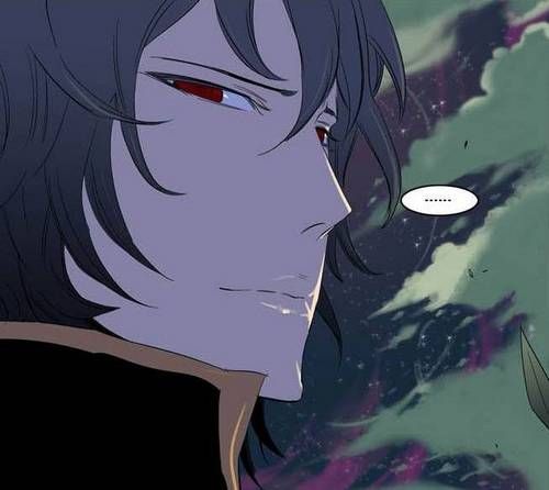
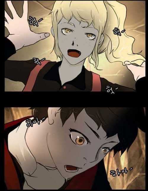
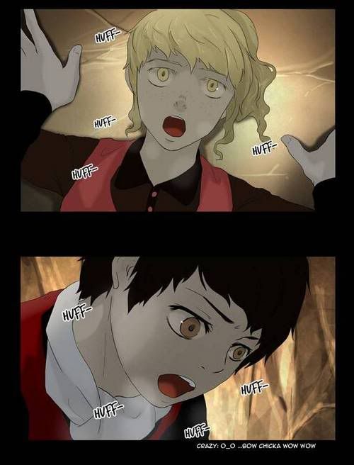
Let's shift the attention to manhwa's this time ;)

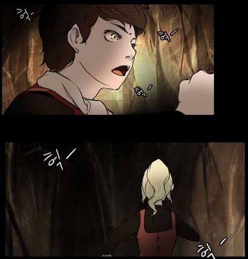
Most people probably know about Noblesse and Tower of God but I think it's fascinating to see how both changed over time.

Comparing Rai now and then:


Comparing the first chapter and the redrawing around 70 chapter later:


Top