Chapter 440 page 17

berto

Artist
中級員 / Chuukyuuin / Member
Joined
Oct 3, 2008
Messages
149
Reaction score
283
Age
46
Gender
Male
Country
France
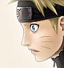
My new coloring for the GFC, from the chapter 440

This time a very beautiful page; hope you like it !! And thanks a lot for your comments :amuse


Zenon

Registered User
中級員 / Chuukyuuin / Member
Joined
May 15, 2009
Messages
183
Reaction score
15
Gender
Male
Country
Italy
very nice!!!!!
 

jawad100

Registered User
下級員 / Kakyuuin / Jr. Member
Joined
Sep 2, 2008
Messages
84
Reaction score
129
Gender
Male
Country
Yemen
nice job thx
 

lee-nus

Artist
英雄メンバー / Eiyuu Menbaa / Hero Member
Joined
Jan 4, 2006
Messages
1,902
Reaction score
611
Age
42
Gender
Male
Country
Sweden
the background is pretty good apart from the dusty clouds, which look a little unnatural. as for the shading, i think its good, but naruto's face, sennin marks, and hair dont work for me. there's too much going on in his hair i think... ^^;
 

Gutinhof

Registered User
初心者/ Shoshinsha / Beginner
Joined
Mar 8, 2008
Messages
47
Reaction score
25
Gender
Male
Country
Brazil
amazing! =)
 

blaarg8891

Registered User
初心者/ Shoshinsha / Beginner
Joined
Jun 23, 2008
Messages
38
Reaction score
16
Gender
Male
Country
United States
I agree with Lee-nus on the clouds looking unnatural, but I disagree with the hair, I think it really fits with your style and I feel you should keep it that way. Good work!
 

juUnior

Intl Translator
MH中毒 / MH Chuudoku / MH Addicted
Joined
Nov 17, 2006
Messages
5,153
Reaction score
1,771
Gender
Male
Country
Poland
The page is kickass from Kishimoto-sama :wtf Adding coloring of berto and we have more kickass badassary coming from the page :wtf Awesome!

 

sam034

Registered User
上級員 / Jyoukuuin / Sr. Member
Joined
May 30, 2008
Messages
306
Reaction score
67
Gender
Male
Country
Netherlands
Damn Berto, if you keep colouring as much as you do now and keep on improving, I don't even want to know how good your pages will be next year :D.

I think it looks great, I rather like how you mixed the Cell shading with the soft. and I think Naruto's hair is really well done.

Something I don't like and I think is a real waste, it's that the giant ball "moon" doesn't have shadow/shading. If you added some shadow the ball would look larger and more ominous. And the panel would also look better.

Anyway great job. greets to Gaara.fr
 

Jaime F.

MH Senpai
英雄メンバー / Eiyuu Menbaa / Hero Member
Joined
Sep 12, 2007
Messages
2,227
Reaction score
166
Gender
Male
Country
United States
Very nice Berto, the only thing that looks just a little bit imperfect, is the line art for Naruto's mouth. On the other hand, it's hard for me to explain what's exactly wrong with it, so it's not a big deal at all. As for the rest of your coloring, it looks awesome. Both characters, and the backgrounds in both panels look very good. Well, thanks again for sharing your new coloring with us Berto, and I look forward to seeing the next 1.
 

- aMt -

Artist
有名人 / Yuumeijin / Celebrity
Joined
Aug 20, 2008
Messages
3,093
Reaction score
517
Age
32
Gender
Male
Country
Brazil
cool
 
Top