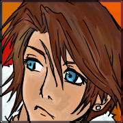
I don't think the eyes necessarily need to be more detailed. I mean, these are almost exact copies of Kishimoto's eyes, and those are more than good enough, not to mention DBZ eyes which are plenty less detailed.
They CAN be more detailed if you want, but it's not an inherent flaw of your drawings, it's more a matter of style and choice. I think this style fits you, but iunno.
A few things:
I actually didn't get what happened these few pages, even after reading it a few times... I got some of it, but some parts are a complete mystery to me.
I would say you need to start having spaces between the panels. Like
http://www.mangapanda.com/naruto/639/5. Aside from just panel borders, having a bit of space between the panels can help the reader see everything more clearly. It's not as necessary in a manga like yours because there's not a lot of action scenes, and
in most pages your backgrounds are nearly non-existent, but I still think it would help make things a lot clearer.
Pages like the one I just linked are a good example of your style: an entire conversation where you can only see one character. We don't get to see Lee, we just see how she reacts to his words. We see a lot of pictures of her to focus on the emotions, even though this entire page could've theoretically been done in just one panel. This is... good, I think.
It shows the mood nicely, and giving so much space for the facial expression really makes the reader takes them seriously. It really makes you think about her emotional reaction to his words, and her pondering when thinking of a solution.
However, with no backgrounds, and the fact you use this technique a lot... it feels empty. Like there's never anything going on, in 90% of the manga it's just characters thinking and feeling and whatever. Which is nice, it gives a certain mood, but you should try not to have too many pages with no background at all.
For instance,
this page after it: it's also just the same character, doing nothing, but the background really helps set the mood, and your shot of the purchase is really well done.
That's the thing about your style with the panels -- it doesn't feel like there's an order, really. It feels like all of the panels are happening at the same time. Which is good for the mood, but in a lot of storytelling aspects, I don't really get what's going on.
Like,
this page, I've been rereading it ten times now and I still don't understand what happened.
The top right panel. There's actually two other panels inside it -- one showing that stone or whatever it is, and the other showing her face, right? That's really hard to see. It took me a few reads to get that. Why? Because the background and the panel borders use the same thickness and same exact lines! I can't tell what's part of the background and what's a whole different panel entirely...
So, because of this, you need to have spaces between the panels. This actually took me a while, haha, but I drew this chart to help you, based on that page.
I still think your art is great and the mood is great and everything, but I just wanted to help you around some technical things.
There's also a bunch of other stuff, like most of your poses look pretty dead and not animated, but that's okay, you will learn that with time. What's important is that your characters still show emotion very well through their faces.
Also, I'm sure you know this, but your style is VERY similar to Naruto. You may want to change that or you may not, that's your choice, but be aware that your characters' faces are damn near identical to Kishimoto's style.


 I did get more practice so the art should be a little bit better now! tell me what you think! thanks ^_^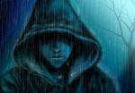

 can improve but its still awesome I just love the way you draw the facial expressions but can you try to give more details on the eyes? for example what you will do when you have to draw a blind character?