
- Joined
- Sep 21, 2009
- Messages
- 297
- Reaction score
- 91
- Age
- 38
- Gender
- Male
- Country
-

Just made this cause i really loved his face expresion, it took me more than an hour like usual so what do you think ????


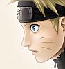


sorry, but this really doesnt work for me at all. he looks like he's got the weirdest suntan ever... :S
its both too sharp (lines) and too blurry (background and half of naruto), and colors dont work together at all. sorry, but maybe that will help you improve somewhat...
 its because i didnt chose the Pick Color, just chose a color and colored the face, the problem is that i duplicated and merged all my layers and i did something to that layer so i cant delete or change the skin tone cause i would change the whole pic.
I only used the blur on the background to make Naruto stand out more , its better this way trust meMight as well finish adding the blur to this pic. Not sure why you like that tool so much.
By the lines you mean they are to strong, black right ?i agree whit lee-nus ,he looks like he spend to much time in the beach , i think that the basics are good but you choose bad the colors , also the blur and the lines are bad ones , if you work on them your work could look great


Firstly you did use the blur on the face. If you want depth of feild do it properly.I only used the blur on the background to make Naruto stand out more , its better this way trust me
By the lines you mean they are to strong, black right ?

LOL i am a student, do you expect that i got plenty of hours to spend on coloringsFirstly you did use the blur on the face. If you want depth of feild do it properly.
Secondly your lines ruin your picture for some reason.
I beg of you please or you will never prosper. TAKE YOUR TIME!!!!!!!!
ffs, artists spend quite a while on their photos so if you want to become better spend more time.
Stop using crappy colour please
I hope next photo you do, you will actually do it much better than this one
 yea you are right about the colors, its just that that i am not experianced with colors, i just pick a color from the color palete and brush away, i just tried to match the color in the color balance but i couldnt.
I would but its to late nowWell why don't you copy someone else's colours?

no men the colors are way to saturated, it makes the pic look wierd and like glowing , if you want a easy way of adjust the colors you just have to go toI would but its to late now
Btw like the colors here ???
Upload it to MEGAUPLOAD - The leading online storage and file delivery service.LOL i am a student, do you expect that i got plenty of hours to spend on colorings
Here is the PSD file if you want to take a look, and that 3rd layer from above is the Merged layer of all layers.
http://uploadpsd.com/file/82437.psd
http://www.uploadpsd.com/upload.php
Sorry if it doesnt work, its my 1st time to upload a PSD
no men the colors are way to saturated, it makes the pic look wierd and like glowing , if you want a easy way of adjust the colors you just have to go to
image>adjust>tone/saturation , here you can select the colors in a easy way , hope it helps
Thanks i will try it