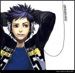
^ Wow that's a pretty sweet logo! I do suggest you remove the extended bit of the lower H so that it's closer to the series logo. Also, I think it would be better to switch the X with a VS. By the way, I like how the X features manga Gon

Thanks you.(And the others too)
Actually, there was a mistake on my part.The funny thing is that I was staring at the original logo the whole time and I still got it wrong.And I called myself a HxH fan.

I was secretly hoping no one will actually noticed it. I had fixed the mistake but somehow I can't upload the fixed version.
My intention in creating the logo is to showcase both version of the anime and a bit of the manga ,hence the small cross featuring manga gon.(Manga gon need to shine too!) I didn't intend to compare both versions.That's why I didn't use the vs sign.
Also ,I got the idea from this logo.
-------------------------------------------------------------------------------------------------------------------------------
For the manga fans ,just for the fun of it.