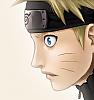
Naruto cap. 426

§madara§

Registered User
中級員 / Chuukyuuin / Member
Joined
Sep 16, 2008
Messages
147
Reaction score
71
Age
31
Gender
Male
Country
Italy


v. 2


v,3


ok, I dared too u.u
 

Y-on

Registered User
中級員 / Chuukyuuin / Member
Joined
Jul 27, 2008
Messages
234
Reaction score
30
Gender
Hidden
Country
United States
First one's decent, the second one, well it's darker, and it doesn't look too appealing as such. The third one is just eww lol, the ambient blue/purple light is just way too abundant. Shadows are pretty choppy on all.
 

lee-nus

Artist
英雄メンバー / Eiyuu Menbaa / Hero Member
Joined
Jan 4, 2006
Messages
1,902
Reaction score
611
Age
42
Gender
Male
Country
Sweden
i can only agree with tsuny... there's so much left to be worked on. i think you should study works that are really good, or that you really like, and try to come up with something more similar. the shading isnt that bad, but its overall very jagged and the third version just doesnt work at all. you need to study secondary lighting a lot more before adding effects like that, it just detracts a ton from the rest right now.
 

thewar

Artist
英雄メンバー / Eiyuu Menbaa / Hero Member
Joined
Feb 20, 2008
Messages
654
Reaction score
249
Gender
Male
Country
Italy
you can better
 

Kazi

Registered User
英雄メンバー / Eiyuu Menbaa / Hero Member
Joined
Jul 20, 2008
Messages
858
Reaction score
56
Gender
Male
Country
Germany
a little hint for resizing the image:
only resize to half of the image. That means if you have a picture 2020x2124 pixel resize to 1010x1062 pixel ... if you resize like that the lines won't look so bad ^^
 

VASSiLi

Manga Editor
英雄メンバー / Eiyuu Menbaa / Hero Member
Joined
Jul 6, 2007
Messages
2,479
Reaction score
4,011
Age
35
Gender
Male
Country
Italy
i can only agree with tsuny... there's so much left to be worked on. i think you should study works that are really good, or that you really like, and try to come up with something more similar. the shading isnt that bad, but its overall very jagged and the third version just doesnt work at all. you need to study secondary lighting a lot more before adding effects like that, it just detracts a ton from the rest right now.
I agree with Lee.
 

Jaime F.

MH Senpai
英雄メンバー / Eiyuu Menbaa / Hero Member
Joined
Sep 12, 2007
Messages
2,227
Reaction score
166
Gender
Male
Country
United States
Yeah the lines look jagged, and I don't think Egaki's original lines look that way. I'm not sure what you did that made the line art look that way, but you should figure out why it happened, and try to avoid doing it the next time around. I'm not sure what you need to do, to make a breakthrough, and start to improve, but you should start to make a better effort in making your colorings look better. It's okay to get a little bit mad at yourself, if it helps you improve. You should raise your standards, is what I guess I'm trying to say. Well, I hope you do better next time around Madara, and it wouldn't hurt to follow some of the advice from the others.
 
Top