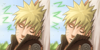
Naruto: thewar

-Ren Boy-

Registered User
有名人 / Yuumeijin / Celebrity
Joined
Mar 22, 2009
Messages
2,679
Reaction score
700
Age
33
Gender
Male
Country
United Kingdom
This is really good especially the fanart itself, but the Narutos feet shadow should not be there otherwise Naruto would be floating in mid air :p
 

Black Lagoon

Intl Translator
有名人 / Yuumeijin / Celebrity
Joined
Mar 11, 2009
Messages
4,328
Reaction score
2,281
Age
38
Gender
Male
Country
Morocco
Nice work dude ^^
 

- aMt -

Artist
有名人 / Yuumeijin / Celebrity
Joined
Aug 20, 2008
Messages
3,093
Reaction score
517
Age
32
Gender
Male
Country
Brazil
ow, so awesome =D
like so much
--
 

Hand Banana

Registered User
上級員 / Jyoukuuin / Sr. Member
Joined
May 2, 2009
Messages
466
Reaction score
113
Gender
Hidden
Country
Antarctica
Pain's expression looks a bit off. I can't put it exactly in words how. But it looks good. Coloring is a level I will never be on.
 

Jaime F.

MH Senpai
英雄メンバー / Eiyuu Menbaa / Hero Member
Joined
Sep 12, 2007
Messages
2,227
Reaction score
166
Gender
Male
Country
United States
I like the idea a lot, and you're fan art skills are getting better. As for the characters, I think Konan looks pretty good, but Naruto, and Pain look a little bit off to me. With Pain, it's mainly the shape of his face. It's not bad, but for some reason I don't like it. Sorry, it's kind of hard for me to explain. As for Naruto, it's mainly the position he's in. In Taekwondo, a martial art from Korea, they call that position a "horse stance." I guess it's because I've grown accustomed to only seeing people, kick, punch, or block in that position. Seeing Naruto with his arms folded in that position, it just looks awkward to me. Of course this is only my personal perspective, and some may see it differently. Well, I hope you didn't mind my criticism's this time, and keep up the good work.
 
Last edited:
Top