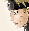
well done, but i'll give my thoughts on it nonetheless!
*the forehead protector could use some more work. details, to be more specific, like the "scar" and the bolts/bolt holes or whatever they are.
*if you really want to be consistent in your coloring, you have to pay strict attention to the light source. here, pain is standing in very strong direct light. basically, only the edges should be highly contrastive. you could still make out his features, and it would make for more interesting coloring too, i think.
that's all, dont really have anything else to nag about... ^^; well, maybe the nose could use another minute's work! XD
the background is pretty cool, just pay attention to the light source and it will look more natural!