
- Joined
- Jun 22, 2009
- Messages
- 4,224
- Reaction score
- 1,235
- Age
- 34
- Gender
- Male
- Country
-

Did it get licensed?C0DE:BREAKER #1 (Available on July 27th)

:3


Did it get licensed?C0DE:BREAKER #1 (Available on July 27th)
:3










and claymore v18i need full covers for;
- Ann Cassandra
- Beelzebub
- Onani Master Kurosawa





 Yotsuya is great like I thought it would be.... And I like Shonen Shikku's cover; not great but reminds me of Area no Kishi's covers.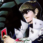










 ! If I had to name one thing I dislike about it though, it would be how simplistic Kishi's colouring has gottent. I miss the old colouring style...
 ! Shame it got cancelled (though I never read it...)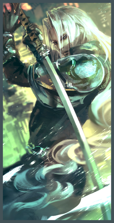


 . Loving the crazy colours on the Reborn volume cover!
Shonen Shikku is already on it's way out, I ignored the cover.Wow, it's funny... everytime Shueisha knocks out another volume of Lilienthal I start to hate them more and more for killing the series. I mean, seriously, that stupid dog cracks me up each and every time!
That series stands high on my "To purchase some time in the future"-list.
As for the sports fraction: Welcome to Plain Land!
I'm used to Kuroko and its crappy covers but to see Shounen Shikku follow the exact same routine... JUMP really needs something new in that perspective. (Comparing these two to the likes of ROOKIES' or Eyeshield's covers makes me wanna cry...)
From this round's big dogs I'm intrigued by One Piece's and, surprisingly enough, Naruto's. Kishimoto really keeps up his 1 outta every 10 statistics for me, as I find the major amount of his covers plain, boring or both - but every now and then there follows a nice one.