- Joined
- Apr 12, 2016
- Messages
- 4,125
- Reaction score
- 5,841
- Country
-

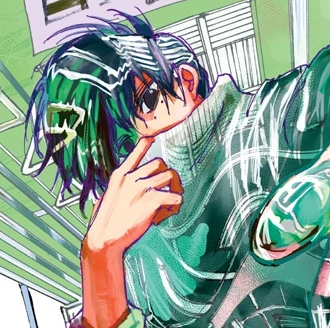
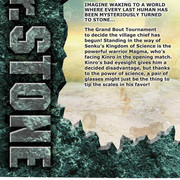
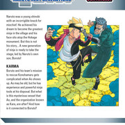
Gotta say that the Haikyu cover is a bit cringey, even if it is symbolism. The character design on Boruto's cover looks bad and Act Age's, while it is drawn nice, the character looks generic as hell, some sort of background art would've helped this generic character design. Ive never been a fan of Dr.stone's covers...pretty weak volume covers this month.
I think HZ & Food Wars (pains me to say it) are the better covers from WSJ titles. WNL looks nice too. Food wars is only one of the better covers for this month since the rest of the competition came up with cringe/bad/generic cover arts. Tbh, that food war cover isnt no where near as good as the ones we've gotten earlier in the series. I honestly find Tosh's art to dip down in quality in recent years. I wonder if he's getting tired of the series too.
I think HZ & Food Wars (pains me to say it) are the better covers from WSJ titles. WNL looks nice too. Food wars is only one of the better covers for this month since the rest of the competition came up with cringe/bad/generic cover arts. Tbh, that food war cover isnt no where near as good as the ones we've gotten earlier in the series. I honestly find Tosh's art to dip down in quality in recent years. I wonder if he's getting tired of the series too.