
- Joined
- Jun 1, 2006
- Messages
- 14
- Reaction score
- 0
- Age
- 37
- Gender
- Male
- Country
-

Hey all, I've seen plently of great cell shading theese past few days. As you know if you seen my other thread, I'm very inexperienced (this is my second coloring), so I figured I try out a different style. It didn't come out the way I wanted it, but overall, I'm pleased with the results.
If you have any comments, critisism, or suggestions, please leave a reply. Even if you don't like it, tell me so, and why, anything will help me improve.
Thanx in advanced!
First version:
http://img107.imageshack.us/my.php?image=yondaimevectorcoloredpostl3nh2.jpg
This I consider to be the "main" version. Contrast was the big reason for my first color's failing. So I wanted to do somthing with a high ammount of contrast. The yellow hair against the black sky, the white coat against the the sky and dark leaves, thats what I was going for. What I don't like is the fact that it looks like yondaime is just standing in front of a pretty background, I wanted him to be "in" the background. It just doesn't seem like its night for him.
Sorry if I didn't discribe that better.
Second version:
http://img522.imageshack.us/my.php?image=yondaimevectorcoloredpostl2pb3.jpg
Theres been a few of these out already, so I need somthing to set this one apart from the others. I originaly planed to change yondaime's inner coat to a different color. But the only ones I considerd decent were taken (blue in the original, and white). So I decided to change the outer coat instead . Kind of looks like an akatsuki though...this wasn't my intention.
Third version:
http://img386.imageshack.us/my.php?image=yondaimevectorcoloredpostlsu6.jpg
This one is the middleground between the two.
Thanx again in advanced!
If you have any comments, critisism, or suggestions, please leave a reply. Even if you don't like it, tell me so, and why, anything will help me improve.
Thanx in advanced!
First version:
http://img107.imageshack.us/my.php?image=yondaimevectorcoloredpostl3nh2.jpg
This I consider to be the "main" version. Contrast was the big reason for my first color's failing. So I wanted to do somthing with a high ammount of contrast. The yellow hair against the black sky, the white coat against the the sky and dark leaves, thats what I was going for. What I don't like is the fact that it looks like yondaime is just standing in front of a pretty background, I wanted him to be "in" the background. It just doesn't seem like its night for him.
Sorry if I didn't discribe that better.
Second version:
http://img522.imageshack.us/my.php?image=yondaimevectorcoloredpostl2pb3.jpg
Theres been a few of these out already, so I need somthing to set this one apart from the others. I originaly planed to change yondaime's inner coat to a different color. But the only ones I considerd decent were taken (blue in the original, and white). So I decided to change the outer coat instead
. Kind of looks like an akatsuki though...this wasn't my intention. Third version:
http://img386.imageshack.us/my.php?image=yondaimevectorcoloredpostlsu6.jpg
This one is the middleground between the two.
Thanx again in advanced!

 .

 !!
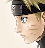

 ), and it seems we had sort of the same idea, somehow. judging from your description, that is. anyway, i like the shades of the hair coming down in the face, but maybe you should add more shades in general? manji suggested to the hair, and he's definitely right about that. also, i think the shade comes across the nose too much. the line there only shows the side, and not the mid point, of the nose, so there is no need for the shade to be draws across the entire nose.
