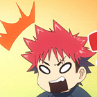
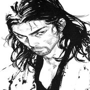
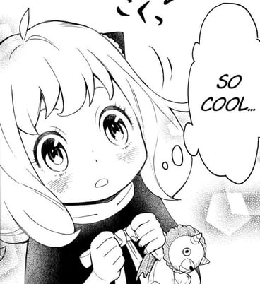
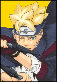
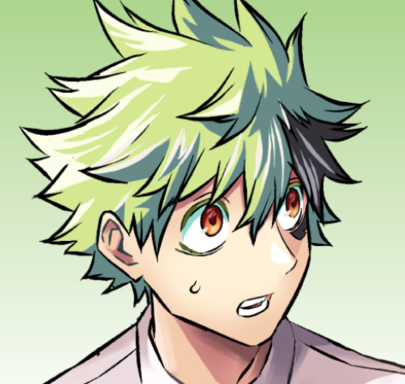
There are very few features which set Miura Tadahiro's artstyle apart from the generic general anime art trends. For example, he gives his characters very thick, even bushy, eyelashes. But the overall proportions, composition and direction hardly stand out. What exactly do you find appealing about his art?
On the other hand, I admit his proficiency with screentones.
Looking at the lineup of anime for this season on Crunchyroll, there's different styles for many of them.
there's moe-art like
some of Black Bullet, Usagi, Kanojo
or art from
Nanana, Chaika, Captain Earth, and Brynhildr
art that's a bit diverse at times
Mekakucity, Nisekoi, Kawaisou
or art that's a bit more plain like
Baby Steps, Matsutaro, Ping Pong, Isshukan Friends
For a lot of panels it looks like it would sorta fall under the second category I made. It's not moe with those big eyes and sorta chibi faces, not minimalist.
On certain panels concentrating on the girls, especially closeups when they blush, there's a lot of detail put into them. Especially the hair, weirdly enough.
The screentones too.
It's kinda a given that faces would have a similar proportion and features unless you have a rather different art style like Boichi or the Isobe guy.
If you look hard enough at anything, you can argue there are similarities, but we're talking about some minute differences here.