Mag Talk Weekly Shonen Jump (2026) - News and Discussion!

Your Favorite Chapters of Issue #49 of 2026 (5 Choices At Most)

  • One Piece 1197

  • Me & Roboco 303

  • Sakamoto Days 281

  • Witch Watch 268

  • Akane-banashi 228

  • Nue's Exorcist 167

  • Kagurabachi 137

  • Ultimate Exorcist Kiyoshi 114

  • Ichi the Witch 104

  • Shinobi Undercover 103

  • Someone Hertz 55

  • RuriDragon 53

  • Under Doctor 38

  • Roku's House of Oddities 28

  • Class 2B Hero Destroyerz 26

  • Animal Signal 20

  • Hal Formula 19

  • Cannon Master 18

  • The Ura Files 9

  • Graykeith: Translator Daemonica 8


The results of this poll are hidden until it is manually edited by the user or site admin.

Shinuki no Reborn

Mangahelper
伝説メンバー / Densetsu / Legendary Member
Mangahelper
Joined
Jul 6, 2011
Messages
15,717
Reaction score
40,478
Age
34
Gender
Male
Country
Brazil
Moderator Notice:

WEEKLY SHONEN JUMP THREAD RULES​

#1. No fights or personal insults.
#2. No bait or troll comments with the intention of being annoying or starting serious heated discussions, if i notice it's a continuous behavior, i will warn the user or delete the comment.
#3. No toxic attitude towards series, no one is obligated to enjoy any series and it's totally fine to criticize what you don't like, just avoid posting gratuitous hateful or toxic comments about X or Y series, if i notice this behavior, comments will be deleted.
#4. Don't bring politics or off-topic stuff to the thread, this is about Weekly Shonen Jump magazine and mangas, so keep any conversation about topics that aren't related about anime & manga outside the thread.
#5. Don't post news about series from other magazine or publishers in the WSJ thread, post in the series own thread, but it's fine if you're mentioning other series or magazine to express a opinion or reflection about Shonen Jump.
#6. Any tweet, specially japanese, about news, update or some interesting thing about the magazine or series has to come with a text of what that tweet means and also be on topic, if not it's going to be either deleted or i will edit the post.
#7. Refrain from self advertising or advertising Youtubers videos in the comments.
#8. Constant fanart posts just for the sake of praising a favorite series is prohibited, this rule doesn't apply for official art by Jump artists posted on social media, they're fine to post.
#9. Don't discuss or hype chapter spoilers before Sunday release, only comment if is related to a series surviving status and do it only inside the spoiler tag.
#10. Regarding rule #9, an exception will be made for when we have new series, in this case, spoilers will be allowed only for the first 3 chapters of a new series for the users who are interested in knowing informations and details about the new series, these spoilers will obviously be kept under tags to protect anyone that doesn't want to be spoiled, so don't worry about it.
~ Shinuki

I hope everyone reads the rules and use it as a guide to behave well in the thread, thanks! :kkthumbs
 
Last edited:

Shinuki no Reborn

Mangahelper
伝説メンバー / Densetsu / Legendary Member
Mangahelper
Joined
Jul 6, 2011
Messages
15,717
Reaction score
40,478
Age
34
Gender
Male
Country
Brazil
Weekly Shonen Jump Issue #49 (2026)
00. Ichi the Witch (Cover & Lead Color Pages)
01. Sakamoto Days
02. One Piece
00. Roku's House of Oddities (Color Page)
03. Akane-banashi
04. Someone Hertz
05. Shinobi Undercover
00. Superpower Battle Fantasy Club (One Shot by Tatara Kyo, Color Page, Golden Future Cup #6)
06. Me & Roboco
00. Under Doctor (Color Page)
07. Graykeith: Translator Daemonica
08. Witch Watch
09. The Ura Files
10. Ultimate Exorcist Kiyoshi
11. Animal Signal
12. Nue's Exorcist
13. Hal Formula
14. Cannon Master
15. Class 2B Hero Destroyerz
16. Kagurabachi

Weekly Shonen Jump Issue #50 (2026) - Information!
Akane-banashi (Cover & Lead Color Pages)
Ultimate Exorcist Kiyoshi (Color Page)
Me & Roboco (Color Page)
Shishikabane (One Shot by Maki Gyujirou, Color Page, Golden Future Cup #7)
 

Kiaida

Registered User
英雄メンバー / Eiyuu Menbaa / Hero Member
Joined
Nov 10, 2021
Messages
1,539
Reaction score
3,723
Country
United Nations
- It seemed like the forum loved JK being LN and Isekai-esque AND it's set in modern day lol. Idk why y'all suddenly are flipped the next round over. Not saying it's like that but I remember that being the assumption before launch since she had a school outfit on and he was...well a demon
Not really. I was defending it from some posts calling it isekai narou slop. lol Only got better after the chapters came out and it was clearly a comedy more similar in tone to Jump gag series.
 

Dippy Fresh

Registered User
英雄メンバー / Eiyuu Menbaa / Hero Member
Joined
Aug 23, 2022
Messages
838
Reaction score
970
Age
26
Country
United States
Not really. I was defending it from some posts calling it isekai narou slop. lol Only got better after the chapters came out and it was clearly a comedy more similar in tone to Jump gag series.
This isn't @ you, but is not everyone already presuming THIS is Isekai slop from a single frame lol?
 

Ricool

Registered User
下級員 / Kakyuuin / Jr. Member
Joined
Sep 10, 2020
Messages
69
Reaction score
202
Age
31
Country
France
Wow, I really don't fit the general consensus here. The only criticism I can agree with is that it is literally the same pose lol

But criticisms:
- Yeah, anybody expecting an ecchi series in modern jump might be holding out for thin hope. It might have fanservice moments like Hima, but it's been 6 years since Miura left Jump and not a serialization attempt yet.
- It seemed like the forum loved JK being LN and Isekai-esque AND it's set in modern day lol. Idk why y'all suddenly are flipped the next round over. Not saying it's like that but I remember that being the assumption before launch since she had a school outfit on and he was...well a demon
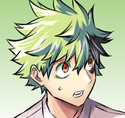
- The protag is very natural to me. Obviously the pub itself doesn't but I thought the Under Doctor MC looked a lot younger and like Deku on the cover too.
- Also, yeah, I would say there's a 2% chance this is anything like Psych House. That's a pretty generic pose, I'm sure if you scavenged old Jump covers you'd find something similar.
- I actually think it'll be the girl isekai'd. The other dude looks fantasy style'd and the background has dragons and such.
- I really don't personally get how y'all got hyped from Under Doctor being a dude smiling with a scalpal and this is a dude smiling with a magic circle and y'all hate it lol. Like Shinuki said, it just feels like you guys had low expectations from SE (fair) and were expecting something drastic from a cover alone
- Finally, it's a cover. Did y'all think Someone Hertz was a 100k seller from it's initial cover? Let's wait for at LEAST the LCP
Let's not pretend this cover has as much personality as Someone Hertz's or Under Doctor's, this feels bland and generic. If someone told me to say which is an instant hit between this or SH based on the cover, I would definitely pick SH because its cover looks way more original

I also particularly dislike the MC's expression, on the preview he looked slightly embarrased so he had a little charm, but here his smile and eyes look so... empty
 

Dippy Fresh

Registered User
英雄メンバー / Eiyuu Menbaa / Hero Member
Joined
Aug 23, 2022
Messages
838
Reaction score
970
Age
26
Country
United States
Let's not pretend this cover has as much personality as Someone Hertz's or Under Doctor's, this feels bland and generic. If someone told me to say which is an instant hit between this or SH based on the cover, I would definitely pick SH because its cover looks way more original

I also particularly dislike the MC's expression, on the preview he looked slightly embarrased so he had a little charm, but here his smile and eyes look so... empty
Honestly, I'm truly trying to understand what personality you're talking about, at least for Under Doctor. Like, what is the key difference between the two, truthfully. Under Doctor to me is also extreme generic. Like, replace the scalpel with a gun and it could literally be ANY oneshot color page since Sakamoto came out

I can agree with the second point but I imagine that's probably more Jump wanting kids to not have their first impression of MC being he's a loser
 

JBC008

Registered User
MH中毒 / MH Chuudoku / MH Addicted
Joined
Apr 17, 2023
Messages
6,073
Reaction score
2,498
Age
35
Country
Avatar
Bro has only one pose.

Amemiya has a decent artstyle but his character design selection is such a bore.
Not in The Great Demon Lord is Sweating.
 

RealityChecker

Registered User
英雄メンバー / Eiyuu Menbaa / Hero Member
Joined
Nov 13, 2025
Messages
784
Reaction score
352
Age
35
Country
Gotei 13
This new batch screams low quality. Under Doctor's first chapter was extremely boring and I think it is going to get repetitive. Now this "isekai" series has one of the worst covers. Not because of the art, but it is really bland. Oof two terrible batches in a row.
 

tirakai

Registered User
MH中毒 / MH Chuudoku / MH Addicted
Joined
Aug 7, 2016
Messages
5,333
Reaction score
7,402
Age
33
Country
Scotland
My standard for a good cover is "If Roboco parodied it, would it be easily recognisable?" Like the latest Roboco volume, it's parodying a volume cover rather than a magazine cover but you can tell instantly that it's Akane-banashi.

Under Doctor's I think would be easy to pick out, but Kinato's isn't quite so distinctive. It's a rather basic battle shounen cover with the two in the background just kind of tossed in there.

A good volume cover doesn't necessarily mean a good series of course, Otr's cover was really well done but it flopped hard.
 

Dippy Fresh

Registered User
英雄メンバー / Eiyuu Menbaa / Hero Member
Joined
Aug 23, 2022
Messages
838
Reaction score
970
Age
26
Country
United States
I think that lends more to the premise than anything the cover is doing. Roboco holding a scalpel? I can really only think of like 1-2 series.

I don't think the design of the cover is anything unique, it's literally just MC smiling, holding a scalpel while bullets and scalpels fly around. Again, replace the scalpel(s) with a gun and you've seen the cover probably last month in a oneshot before.

To me, they're both basic but what matters is what the actual content is
--- Double Post Merged, , Original Post Date: ---

Also, SE had some interesting covers for volumes...meant nothing on the writing quality similarly to Otr
 

Ricool

Registered User
下級員 / Kakyuuin / Jr. Member
Joined
Sep 10, 2020
Messages
69
Reaction score
202
Age
31
Country
France
Honestly, I'm truly trying to understand what personality you're talking about, at least for Under Doctor. Like, what is the key difference between the two, truthfully. Under Doctor to me is also extreme generic. Like, replace the scalpel with a gun and it could literally be ANY oneshot color page since Sakamoto came out

I can agree with the second point but I imagine that's probably more Jump wanting kids to not have their first impression of MC being he's a loser
I will cite the elements that, to me, makes Under Doctor's cover much more dynamic and full of personality compared to Kaigeki no Kinato's (KnK):
- Under Doctor's MC's design is original, with elements that make him stand out (the hair, the glasses). KnK's MC looks very generic and doesn't have a lot going for him, and the other characters aren't much better;
- Under Doctor's cover's colors are much more vibrant, with a red, black, cyan and white palette that instantly catch the reader's eye while KnK's cover doesn't have this effect at all;
- The composition for Under Doctor's Cover is much more eye catching too. The MC is surrounded with bullets and scalpels and his pose is very dynamic. The cover's lighting is great too, with shades highlighting the silhouette in the MC's glasses and giving a sense of mystery to it. Meanwhile, KnK's MC is doing a very classical "hands forward" pose with characters to his left and right. This composition is very classical and makes it look generic.

Overall, I just think that if I was a teenager and walked across Under Doctor's cover, I would think it's cool and appealing, while KnK's feels very standard
 

Dippy Fresh

Registered User
英雄メンバー / Eiyuu Menbaa / Hero Member
Joined
Aug 23, 2022
Messages
838
Reaction score
970
Age
26
Country
United States
I will cite the elements that, to me, makes Under Doctor's cover much more dynamic and full of personality compared to Kaigeki no Kinato's (KnK):
- Under Doctor's MC's design is original, with elements that make him stand out (the hair, the glasses). KnK's MC looks very generic and doesn't have a lot going for him, and the other characters aren't much better;
- Under Doctor's cover's colors are much more vibrant, with a red, black, cyan and white palette that instantly catch the reader's eye while KnK's cover doesn't have this effect at all;
- The composition for Under Doctor's Cover is much more eye catching too. The MC is surrounded with bullets and scalpels and his pose is very dynamic. The cover's lighting is great too, with shades highlighting the silhouette in the MC's glasses and giving a sense of mystery to it. Meanwhile, KnK's MC is doing a very classical "hands forward" pose with characters to his left and right. This composition is very classical and makes it look generic.

Overall, I just think that if I was a teenager and walked across Under Doctor's cover, I would think it's cool and appealing, while KnK's feels very standard
Maybe it's me, but I just find Under Doctor's not too original personally from cover alone.

MC's design is definitely MORE unique but I feel like you truly see that more in the LCP. Like I said before, cover alone I truly thought he looked a lot like Deku which didn't help after I learned he was an MHA assistant

The colors also remind me a lot of Kagurabachi which are definitely bolder for an action series but I don't think this series is trying to be. If it's a slice of life (idk yet) I think the colors reflect that relaxed vibe, we'll have to see there.

I also already said how I find the bullets and such to just be very generic.

Just to me, I think covers usually, USUALLY don't wow me in general so this is not offensive to me at all. There are exceptions like that Ichi cover last year (GORGEOUS) but most are going to be pretty bare bones. I get intrigued on LCP's more
 

RealityChecker

Registered User
英雄メンバー / Eiyuu Menbaa / Hero Member
Joined
Nov 13, 2025
Messages
784
Reaction score
352
Age
35
Country
Gotei 13
I will cite the elements that, to me, makes Under Doctor's cover much more dynamic and full of personality compared to Kaigeki no Kinato's (KnK):
- Under Doctor's MC's design is original, with elements that make him stand out (the hair, the glasses). KnK's MC looks very generic and doesn't have a lot going for him, and the other characters aren't much better;
- Under Doctor's cover's colors are much more vibrant, with a red, black, cyan and white palette that instantly catch the reader's eye while KnK's cover doesn't have this effect at all;
- The composition for Under Doctor's Cover is much more eye catching too. The MC is surrounded with bullets and scalpels and his pose is very dynamic.
I think this means Under Doctor is heavily based on Kill Blue.
 

Ricool

Registered User
下級員 / Kakyuuin / Jr. Member
Joined
Sep 10, 2020
Messages
69
Reaction score
202
Age
31
Country
France
Maybe it's me, but I just find Under Doctor's not too original personally from cover alone.

MC's design is definitely MORE unique but I feel like you truly see that more in the LCP. Like I said before, cover alone I truly thought he looked a lot like Deku which didn't help after I learned he was an MHA assistant

The colors also remind me a lot of Kagurabachi which are definitely bolder for an action series but I don't think this series is trying to be. If it's a slice of life (idk yet) I think the colors reflect that relaxed vibe, we'll have to see there.

I also already said how I find the bullets and such to just be very generic.

Just to me, I think covers usually, USUALLY don't wow me in general so this is not offensive to me at all. There are exceptions like that Ichi cover last year (GORGEOUS) but most are going to be pretty bare bones. I get intrigued on LCP's more
I usually am not the biggest fan of first covers either, they often look nice, but most of the time they do not really catch my eye.

Under Doctor's cover just feels like an example of a thought out cover: it's dynamic, it has a strong visual identity with the MC design and the great color palette (I always love when the WSJ title has different colors from the usual red or yellow) and it also feels mysterious.

In comparison, KnK's cover feels barely serviceable to me, so I was surprised by your take about the two covers. But let's agree to disagree
 
Last edited:

Dippy Fresh

Registered User
英雄メンバー / Eiyuu Menbaa / Hero Member
Joined
Aug 23, 2022
Messages
838
Reaction score
970
Age
26
Country
United States
I usually am not the biggest fan of first covers either, they often look nice, but most of the time they do not really catch my eye.

Under Doctor's cover just feels like an example of a thought out cover: it's dynamic, it has a strong visual identity with the MC design and the great color palette (I always love when the WSJ title has different colors from the usual red or yellow) and it also feels mysterious.

In comparison, KnK's cover feels barely serviceable to me, so I was surprised by your take about the two covers. But let's agree to disagree
Fair enough, might just be a matter of taste. I think if I were to design Under Doctor, I might have included sparkles related to his ability or added more science elements? But hey, covers are a tricky beast.

I know I'm not the biggest Under Doctor fan yet (hoping to change that) but the LCP is good. Gives SxF vibes in the best way
 

cameronney618

Registered User
英雄メンバー / Eiyuu Menbaa / Hero Member
Joined
Jul 22, 2025
Messages
737
Reaction score
1,008
Age
33
Country
Brazil
I think Chainsawman's was the only debut cover i really like. That aside, almost every debut series shares the same pose and layout.

Maybe Jump's Cover designer are the crux to all generic Jump covers.

Edit: After looking up, I think Dragonball's the only other good one. I don't think Jump let's their artist take creative liberty in the cover layout unless you have some prestige prior to your debut series.
 
Last edited:

Phantom RPG

Registered User
英雄メンバー / Eiyuu Menbaa / Hero Member
Joined
Feb 17, 2020
Messages
1,119
Reaction score
1,235
Age
28
Country
Brazil
Btw according to Ryo Kaigeki no Kinato is not Isekai or something, he even jokes about how Jump seems to be determined to avoid doing isekai lol
Thank god.

From the cover, it made it look like that, no offense.

He looks so cute, hype.
Shark, once again, has his priorities straight from the get-go. Never change, Shark, never change.

Shinuki, here is another one-shot author, actually three authors, I want you to take a look at, as both I felt very interested in for different reasons altogether.

Hamano Nene or Hamano Otone(It's still kinda unclear which is the actual one, most likely the former), a fan of One Piece, i can can see some of its inspiration within the artstyle

Enkiribito in Jump Giga Autumn 2024


True End in Jump Giga Winter 2025


On the other hand, it would be the likes of Nishimura Ann, who debuted a one-shot in Jump Giga Winter 2025:


Lastly, the other author i hand in mind would be the likes of Motobucho, who debuted a one-shot which was shown in Jump Giga Summer 2025


icrawfish

Registered User
英雄メンバー / Eiyuu Menbaa / Hero Member
Joined
Nov 5, 2024
Messages
792
Reaction score
1,248
Age
25
Country
United States
Hamano Nene or Hamano Otone(It's still kinda unclear which is the actual one, most likely the former), a fan of One Piece, i can can see some of its inspiration within the artstyle
Some is an understatement, a lot of the faces look a LOT like the One Piece artstyle, to the point I’d be inclined to think it’s intentionally based on it. The fact that the cop looks a lot like Zoro too unintentionally plays into western meme culture surprisingly well, haha.

The artstyle for the second person kind of gives me slight Shinohara vibes, with a touch of Fujimaki. The third one has a few character faces that remind me of Centuria’s author, Tohru Kuramori (especially the young girl).
 

Phantom RPG

Registered User
英雄メンバー / Eiyuu Menbaa / Hero Member
Joined
Feb 17, 2020
Messages
1,119
Reaction score
1,235
Age
28
Country
Brazil
Some is an understatement, a lot of the faces look a LOT like the One Piece artstyle, to the point I’d be inclined to think it’s intentionally based on it. The fact that the cop looks a lot like Zoro too unintentionally plays into western meme culture surprisingly well, haha.

The artstyle for the second person kind of gives me slight Shinohara vibes, with a touch of Fujimaki. The third one has a few character faces that remind me of Centuria’s author, Tohru Kuramori (especially the young girl).
I know, right? But you cannot deny that the art has improved from the autumn issue to the winter one. Also, the one-shot for the one-shot "true end" was kinda interesting to see.

Have the color pages been released yet? Curious to see how they turn up.
 
Last edited:
Top