Re: All Purpose Sig Contest Discussion Thread 2010
Still on vacation...s l o w.... i n t e r n e t
@Shin - I agree with Kakashi's points about your Gundam sig. I wouldn't say I totally dislike the yellow, but I think there is a bit too much of it, and maybe part of the text could blend in a bit more or there could be some other subtle effects around the render to compliment/balance out the yellow. I'm also am not a fan of Gundam, so I can't say if it fits the character. I really like the grunge type blend between the black background and the render.
@Roflkopt3r - I think Toshiro is a good idea. When I followed Bleach, he was one of my more favorite characters, and I think he's generally quite popular, plus a great representative of the wings theme. Although, I can imagine coloring ice is diffcult, but I think you have the talent to do it. You got my vote in the summer art contest.

@ Kakashi - That wing effect looks beautiful, on the 2nd version I really like the right side, but think the original see through wings are overshadowed by that eye shaped white spot on the left side. 2nd Render is much better. Btw, the lighting effect on the wings is truly amazing, one of the best things I've seen. Great work!

@Bugzee -

Congrats on the win for best Summer Signature!!! That one was a classic.
@Faux-kun - Welcome to the contest, glad to see another participant.
As for the wings theme. If I make a wings theme sig I'm thinking of doing something from Blood +. But, I really have to write a chapter of my thesis when I get home, so my participation here may wane in the next month or two.




















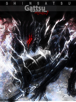


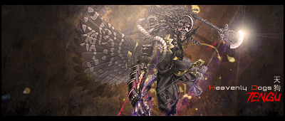
 My computer has been malfunctioning since midweek, and I am using my phone for this.
  ... Anyway...