All Purpose Sig Contest Discussion Thread 2008-2011

Status
Not open for further replies.

~Coffee~

MH Senpai
英雄メンバー / Eiyuu Menbaa / Hero Member
Joined
Jan 30, 2010
Messages
1,129
Reaction score
1,014
Gender
Male
Country
United States
Re: All Purpose Sig Contest Discussion Thread 2010

I have a HUGE storage of renders on my computer, when a new theme comes up, I usually dig through that storage and find ones that fit, move them to a new folder and then proceed to make several sigs with those renders, till I get one that I like.

I changed the render a little bit to make it look a bit better for the sig, and the background is made from a copy of the render XD


my Renders folder is around 1.5 gigs now XD
 
Last edited:

Bugzee

MH Senpai
MH中毒 / MH Chuudoku / MH Addicted
Joined
May 17, 2009
Messages
8,407
Reaction score
5,223
Gender
Male
Country
United Kingdom
Re: All Purpose Sig Contest Discussion Thread 2010

Ain't you the luck one. :neutral =P
 

Gecko Moria

MH Senpai
英雄メンバー / Eiyuu Menbaa / Hero Member
Joined
Nov 6, 2008
Messages
1,074
Reaction score
288
Gender
Male
Country
New Zealand
Re: All Purpose Sig Contest Discussion Thread 2010

"capturing the essence of the blood theme." :o
Now why are you quoting me? :p

Feedback? (ignore the crappy-ness of the text for now)
"For the sake of Zero Requiem" :cheerbunny

Completely and utterly stunning Coffee :o

A refined and imaginative method of approaching the theme. One of the great things of having an abstract theme like government is the wide variety of interpretations that will come from different artists. The signature itself is very professionally done and I imagine it will be difficult to top. Suzaku's sword is practically glittering on my screen.

Were the Japanese characters in the signature part of the picture or did you write them in yourself?
 
Last edited:

~Coffee~

MH Senpai
英雄メンバー / Eiyuu Menbaa / Hero Member
Joined
Jan 30, 2010
Messages
1,129
Reaction score
1,014
Gender
Male
Country
United States
Re: All Purpose Sig Contest Discussion Thread 2010

Wrote them in myself~ Sees and joins C.C. fanclub and shares this -


Shinsatsu

MH's Most Fashionable Member
有名人 / Yuumeijin / Celebrity
Joined
Dec 1, 2007
Messages
2,966
Reaction score
2,817
Age
38
Gender
Male
Country
Morocco
Re: All Purpose Sig Contest Discussion Thread 2010

Damn, If I turn on photoshop I'm afraid I will go on a sig rampage again...
P.S: nice sig Coffee xD but the bottom smudged render looks kinda obvious :S (right side).
 

nanaDmari

MH Senpai
英雄メンバー / Eiyuu Menbaa / Hero Member
Joined
Feb 1, 2010
Messages
2,115
Reaction score
1,176
Gender
Female
Country
Brazil
Re: All Purpose Sig Contest Discussion Thread 2010

Your sig is really cool, coffee >_<

but isn't "zero requiem" supposed to be written in katakana instead of hiragana? and "zero" instead of "rei"?

and 1.5 gb is a lot @___@
 

Shinsatsu

MH's Most Fashionable Member
有名人 / Yuumeijin / Celebrity
Joined
Dec 1, 2007
Messages
2,966
Reaction score
2,817
Age
38
Gender
Male
Country
Morocco
Re: All Purpose Sig Contest Discussion Thread 2010

I made a sig and I don't know if it fits the theme well :D
What do you think?
 

Gecko Moria

MH Senpai
英雄メンバー / Eiyuu Menbaa / Hero Member
Joined
Nov 6, 2008
Messages
1,074
Reaction score
288
Gender
Male
Country
New Zealand
Re: All Purpose Sig Contest Discussion Thread 2010

Your sig is really cool, coffee >_<

but isn't "zero requiem" supposed to be written in katakana instead of hiragana? and "zero" instead of "rei"?

and 1.5 gb is a lot @___@
That's what I was going to say ;)

Where did you learn Japanese Coffee?
 

DeBaron8

Artist
英雄メンバー / Eiyuu Menbaa / Hero Member
Joined
Feb 3, 2010
Messages
551
Reaction score
571
Gender
Hidden
Country
Canada
Re: All Purpose Sig Contest Discussion Thread 2010

@ Coffee - Really like your sig!:D I assume you will remove the Roman characters? I think it will look best just witht the Japanese text. :) I really like the effects around the render, they are subtle but suit the render very well. I think the only thing I would try to improve, which you may not want to, it the painting of the render on the golden handle of the sword. I'm not sure if you changed it or that's the way it was, but I would like to see more detail on the metal. It kinda looks too plain at the moment. I think it would be sweet if it looked more like real metal and have some nice lustre on it, because at present the lighting looks off and it doesn't have any texture or depth. Other than that small detail, it's an awesome sig!

@ Shinsatsu - Nice Death Note Sig! :D I think it suits the theme very well. I always love your sigs, the painting in the top right is great and so are the wings.

@ NanaDmari - Great entry, I really like that old propaganda style of art it looks cool. Btw, how did you mimic the .png cutout with a .jpeg? Did you use a screenshot of the forum to find the exact color and then apply that as a background? Anyway whatever you did, you made it look just like a .png, nice work! :thumbs
 

~Coffee~

MH Senpai
英雄メンバー / Eiyuu Menbaa / Hero Member
Joined
Jan 30, 2010
Messages
1,129
Reaction score
1,014
Gender
Male
Country
United States
Re: All Purpose Sig Contest Discussion Thread 2010

Damn, If I turn on photoshop I'm afraid I will go on a sig rampage again...
P.S: nice sig Coffee xD but the bottom smudged render looks kinda obvious :S (right side).
Well, I wasnt trying to make it unnoticeable....~

Your sig is really cool, coffee >_<

but isn't "zero requiem" supposed to be written in katakana instead of hiragana? and "zero" instead of "rei"?

and 1.5 gb is a lot @___@
Shhhhhhhh........XD

I made a sig and I don't know if it fits the theme well :D
What do you think?
I was thinking about doing a Yagami route as well, since he was fighting against the government .~

That's what I was going to say ;)

Where did you learn Japanese Coffee?
I wouldn't say I really learned it at all.... The thing with my sig is availability, what I had available in my photoshop~ XD For the sake of you guys who actually know, Ill attempt to fix it~

@ Coffee - Really like your sig!:D I assume you will remove the Roman characters? I think it will look best just witht the Japanese text. :) I really like the effects around the render, they are subtle but suit the render very well. I think the only thing I would try to improve, which you may not want to, it the painting of the render on the golden handle of the sword. I'm not sure if you changed it or that's the way it was, but I would like to see more detail on the metal. It kinda looks too plain at the moment. I think it would be sweet if it looked more like real metal and have some nice lustre on it, because at present the lighting looks off and it doesn't have any texture or depth. Other than that small detail, it's an awesome sig!
Thank you for the feedback. I was trying to immerse the render into the sig more by having some of those effects come in front of the render as well, but you are right that the effects on the handle look out of place, so Ill work on fixing that. Thank you~


Anyways, I updated it a little bit (Before I got the feedback about the japanese and the out of place effects.) So I would appreciate to hear more from you guys~


AND
Which one looks better?

Or With some added depth?
 
Last edited:

nanaDmari

MH Senpai
英雄メンバー / Eiyuu Menbaa / Hero Member
Joined
Feb 1, 2010
Messages
2,115
Reaction score
1,176
Gender
Female
Country
Brazil
Re: All Purpose Sig Contest Discussion Thread 2010

@ NanaDmari - Great entry, I really like that old propaganda style of art it looks cool. Btw, how did you mimic the .png cutout with a .jpeg? Did you use a screenshot of the forum to find the exact color and then apply that as a background? Anyway whatever you did, you made it look just like a .png, nice work! :thumbs
Thanks!
Yes, that's what I did XD
but I used web developer tool from the browser to find the color...

I wouldn't say I really learned it at all.... The thing with my sig is availability, what I had available in my photoshop~ XD For the sake of you guys who actually know, Ill attempt to fix it~
hehe ok... details can sometimes make the difference...
I think the text looks better in the new versions, but I don't see the need of the red in the second one...

and as for the other one, I think you can add depth but a less than you did in the second version... I can see too much isolated pixels there...

I think Ligth fits the theme well, like the others said... good sig, shinsatsu!
 

DeBaron8

Artist
英雄メンバー / Eiyuu Menbaa / Hero Member
Joined
Feb 3, 2010
Messages
551
Reaction score
571
Gender
Hidden
Country
Canada
Re: All Purpose Sig Contest Discussion Thread 2010

@Coffee - The second version of the Zero Requiem sig is great! The effects around the handle look much better. :D Though IMO, I'd still prefer the Japanese characters to be reversed with the Roman characters, so that they are in front, but that's just a personal preference. The text itself really suits the sig though, I love the more visible color gradient in the first edition. Your second government sig is also very nice, but I like the Zero Requiem one better. For the second sig, I like the first version better. I agree with Nana, that the second one is oversharpened a bit in places, mabye something in between the two could work.

@Shinsatsu - Congrats on winning the b-day banner contest! Luffy's celebratory expression is great and so are the effects. :D
 

~Coffee~

MH Senpai
英雄メンバー / Eiyuu Menbaa / Hero Member
Joined
Jan 30, 2010
Messages
1,129
Reaction score
1,014
Gender
Male
Country
United States
Re: All Purpose Sig Contest Discussion Thread 2010

Ok, so the Red-ish glow on the letters was a bad idea it sounds like. With the Saber sig, I threw in a highpass to see what people thought of it.


and I also thought of another theme for Tsukisama, if you are still around. LOL..
Pizza~


Yes, Congrats again shinsatsu, go figure that its a One Piece banner... XD
 
Last edited:

Gecko Moria

MH Senpai
英雄メンバー / Eiyuu Menbaa / Hero Member
Joined
Nov 6, 2008
Messages
1,074
Reaction score
288
Gender
Male
Country
New Zealand
Re: All Purpose Sig Contest Discussion Thread 2010

Shinsatsu: Congratulations on the winning birthday banner. The only criticism I can offer on the Light signature is I would add a few more colors through patterns or something since you've really only got the red and brown. I would also prefer if it didn't have that thick borderline on the top and bottom, the sides are fine though.

Coffee: I agree with DeBaron8 in saying the second version of the signature looks better. The extra bit of shine on the gold parts of the sword makes it stand out more from the dark background. I also really like that Saber signature you did (and not just because it features one of my favorite anime characters). The only thing I would recommend is take out all the small text (since it's too difficult to read anyway) and just leave KING. Otherwise a brilliant signature, the background works very harmoniously and the lines flowing down the left side was a nice touch.

Also, thanks for sharing that C.C. picture Coffee. Beautiful~
 
Last edited:

Shinsatsu

MH's Most Fashionable Member
有名人 / Yuumeijin / Celebrity
Joined
Dec 1, 2007
Messages
2,966
Reaction score
2,817
Age
38
Gender
Male
Country
Morocco
Re: All Purpose Sig Contest Discussion Thread 2010

Shinsatsu: Congratulations on the winning birthday banner. The only criticism I can offer on the Light signature is I would add a few more colors through patterns or something since you've really only got the red and brown. I would also prefer if it didn't have that thick borderline on the top and bottom, the sides are fine though.
:D
I tried a new technique and it works best with few colors. Thanks for the feedback =/ I won't post that sig as my entry because I didn't like it when I looked at it this morning (always happens to me).


P.S thank you everyone ^^


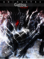
Another Death Note sig...
 
Last edited:

DeBaron8

Artist
英雄メンバー / Eiyuu Menbaa / Hero Member
Joined
Feb 3, 2010
Messages
551
Reaction score
571
Gender
Hidden
Country
Canada
Re: All Purpose Sig Contest Discussion Thread 2010

@Shin - Yeah, I like this Death Note sig even better! It has great ligthting around the render and the border is really unique.
 

Shinsatsu

MH's Most Fashionable Member
有名人 / Yuumeijin / Celebrity
Joined
Dec 1, 2007
Messages
2,966
Reaction score
2,817
Age
38
Gender
Male
Country
Morocco
Re: All Purpose Sig Contest Discussion Thread 2010

@Shin - Yeah, I like this Death Note sig even better! It has great ligthting around the render and the border is really unique.
Thanks,
I decided to submit it before I grow tired of it again.
 

~Coffee~

MH Senpai
英雄メンバー / Eiyuu Menbaa / Hero Member
Joined
Jan 30, 2010
Messages
1,129
Reaction score
1,014
Gender
Male
Country
United States
Re: All Purpose Sig Contest Discussion Thread 2010

Coffee: I agree with DeBaron8 in saying the second version of the signature looks better. The extra bit of shine on the gold parts of the sword makes it stand out more from the dark background.
- Good Good~ I fixed the effects up a little on the previous suggestions and tried my hand at Katakana, is this correct for "Zero Requiem?


I also really like that Saber signature you did (and not just because it features one of my favorite anime characters). The only thing I would recommend is take out all the small text (since it's too difficult to read anyway) and just leave KING. Otherwise a brilliant signature, the background works very harmoniously and the lines flowing down the left side was a nice touch.

Also, thanks for sharing that C.C. picture Coffee. Beautiful~
Oh, I saw a sig that had something similar to this and I thought it looked good. I also thought that it wasnt meant to actually be read and could be just random words, though mine are Quotes from FSN.
The clouds drift and the moon appears for a brief moment.
"I ask of you, are you my master?"
It feels like time has stopped just around me.
"From this time forth, my sword shall be with you and your fate shall be with me."
"You were my sheath."
A complete world seperate from this one that can never be reached.
The greatest protection in this world.
The greatest that cannot be infringed by anything not even the fice sorceries.
For that reason, the sheath is named Avalon, All is a Distant Utopia.
The utopia the king dreamed of that will never be reached.
The Golden Sword was swung.
She must not even have the energy to raise it back up.
The waves of light like a flood are no more.
"I will destroy the Holy Grail. That is my role."
She was born as a king and lived as a king.
That is her pride.
"In the end there is one thing I must tell you."
...And in a voice without regret...
says those words...
But are you saying it would be better if you could read them?

Thanks!
Yes, that's what I did XD
but I used web developer tool from the browser to find the color...
- I usually just use my Photobucket account when I turn in a sig.

@Shinsatsu - I like the second sig better, good call. Nice Text and I like the scanlines on the right there.
The first one, the stretch effect (especially on top of lights head) I though didnt look so good.
 

nanaDmari

MH Senpai
英雄メンバー / Eiyuu Menbaa / Hero Member
Joined
Feb 1, 2010
Messages
2,115
Reaction score
1,176
Gender
Female
Country
Brazil
Re: All Purpose Sig Contest Discussion Thread 2010

- Good Good~ I fixed the effects up a little on the previous suggestions and tried my hand at Katakana, is this correct for "Zero Requiem?

I usually just use my Photobucket account when I turn in a sig
It should be ゼロ レクイアム (I'm not sure about requiem... I think re-ku-i-a-mu is the closest to the correct pronounce...)

and I thought we should use the gallery... but it's ok... and I uploaded my png in my deviantart...
 

~Coffee~

MH Senpai
英雄メンバー / Eiyuu Menbaa / Hero Member
Joined
Jan 30, 2010
Messages
1,129
Reaction score
1,014
Gender
Male
Country
United States
Re: All Purpose Sig Contest Discussion Thread 2010

Oh.... Ok XD Looking back on it I dont know why I was fooled into Ji-e instead of Ze and Ri instead of Re... But do you think Rekuiamu is better than Rekuiemu?

and I do use the gallery ~


The image is showing from my Photobucket, but when you click it it links over to DeBarons government entry.
HTML:
[url="http://mangahelpers.com/gallery/sig-contest-submissions/13008"] [img]http://img.photobucket.com/albums/v723/SSXVegeta/IceyIceZoneTry1.png[/img][/url]
 
Status
Not open for further replies.
Top