What about a zodiac theme? Everyone can choose to use their own zodiac symbol or whichever they want from either the Chinese zodiac or the normal signs.
Ya, that is what I was talking about..... instead of a really broad thing like "Green" there could be something a lot more focused but still has room for difference...
- a middle ground between "green" and "same render" like a theme where you have to use a character from a certain anime series... or a certain type of car.... or more focused like using a specific character from a series(all can use different renders)~
@Shinsatsu
- Your entry for this theme, gave me an idea
- GJ and thank you~
What about a zodiac theme? Everyone can choose to use their own zodiac symbol or whichever they want from either the Chinese zodiac or the normal signs.
Thank you very much for the suggestion. I believe that someone has previously suggested it, as it is already on my list of possible themes. You can expect to see this theme at some point in the future. You get 50 points if you use the power of the stars to correctly predict when the zodiac theme shall occur.
Because of the time change here in the US (and perhaps some other places too), people who underwent a time change for Daylight Savings Time will have lost one hour on the revolution contest. Thus, I shall leave the contest open until around 11:30 pm EST but shall start the new contest at around 10:30 pm EST, which would be the regular two-week time period.
So, for those who do not live in the US and wonder why the revolution contest seems to be open for one hour longer than two weeks, that's why.
Well, I hope you like this next theme. The contest is up, and the theme is Chibi. If you guys remember, I believe someone suggested this theme around the beginning of the year, and now it is finally here! All your signature needs to have is a chibi in it.
For those who don't know what chibi means, look here, specifically
I hope you have fun with this theme! Warning: You may experience bouts of wonderment due to the high levels of cuteness.
The revolution contest is now closed. There are eight great submission from which to choose, but which shot shall be heard 'round the world? You decide! Cast your vote within one week's time to decide the winner.
OMG!!! This theme will be epic!!! I'm so excited to see what everyone makes. I already have one render in mind. But there are so many options, what a great theme! I can't remember who suggested it, Coffee perhaps? But, whoever it was thanks.
Yes indeed, it was me Debaron - but Tsukisama said something about that it might be considered to close to being the same as the Baby theme~
and Hello OneClash!
I also just noticed that 'Zee didnt submit anything this time... T_T
I was working on a Formula One signature. It's still incomplete. You guys all went for the same kind of revolution. I had my eyes set on R.P.M
Coffee, you should be happy I missed the deadline. hahaha~ I'll post it up once I finished it. ;P This Chibi theme is cool. It's something that I fear Farfalla and you two (Coffee and Shin) will take great advantage of. I'm sure you guys will obviously go different directions with it but ultimately create the perfect combo to break the limits of kawaiiii-ness.
Hmmmm...another theme I have no experience with. This should be a good challenge. Never worked with chibi renders before
Hope I come up with something good
@'Zee
- I also had 4-5 car renders set aside for a RPM type sig, as Ive seen some awesome car sigs, where the focus was 'spinny' effects around the wheel(s)~
Cannot wait to see it~
lol I was wondering when I started reading that~ I was like "Wut? I didn't post anything...?"
anyways here is my first idea for Chibi theme, after looking at my renders at 5 am last night XD - its like 10 minutes of work... so no "Its really plain" comments please... but if theres any helpful ideas, im all ears (eyes?)
Also a quick question I keep forgetting to pose to you Tsukisama!
@Tsukisama
- The size limitations for sig entries are 550x170 - Does that include transparent area - as if one made a sig like above?
I ask this question because I was always under the impression that it DID include the transparent space but at one point I saw a submission that was over the allotted size and the entrant commented that the visible image was within the boundary and that there was just some blank area around it. There didn't seem to be any objections at the time and I just never remembered enough to ask~
<hr noshade size="1">
Also a quick question I keep forgetting to pose to you Tsukisama!
@Tsukisama
- The size limitations for sig entries are 550x170 - Does that include transparent area - as if one made a sig like above?
I ask this question because I was always under the impression that it DID include the transparent space but at one point I saw a submission that was over the allotted size and the entrant commented that the visible image was within the boundary and that there was just some blank area around it. There didn't seem to be any objections at the time and I just never remembered enough to ask~
Very good question. The answer is yes. The size limitations are about the complete size of the file, transparency and all.
I think I know the submission you are mentioning, but I might be thinking of another one. When someone violates the rules for the first time or so, I typically don't make a big deal about it and just contact the person via private messaging on the matter. So, it might not seem like any action was taken to outside observers, but there usually is.
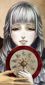
@ Coffee - Cool pop out idea. I think you could experiment with the render in the center of the sig. You'd just have to make something for her to be coming out of, so it would be more difficult and still may not look as good. I also think the text centered like it is looks weird, I'd have it closer to the render.
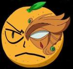
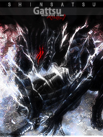
@ Shin - Where has the cuteness gone? I love the overall sig, sigs with unique shapes can be totally amazing when well executed, but this sig is also kinda creepy.
Here's my go at the theme, I probably won't make another, but any feedback on how I could improve this one, would be most appreciated. Thanks^^
@ Shin - Where has the cuteness gone? I love the overall sig, sigs with unique shapes can be totally amazing when well executed, but this sig is also kinda creepy.










 But there are so many options, what a great theme! I can't remember who suggested it, Coffee perhaps? But, whoever it was thanks.






 .
.