- Joined
- Aug 26, 2006
- Messages
- 1
- Reaction score
- 0
I'd just like to know if ES21 volumes 13-14 really don't have covers... And is the group pic on ES21 vol 14 ch114 the cover? Thanks!


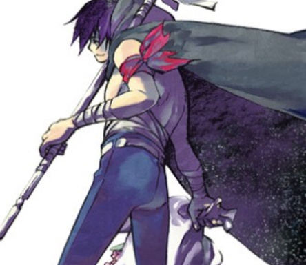

 It's SO nice!


 Remember if there's anything you guys want F-M to release along just pm me or just place a msg in the f-m art thread here. [br]Posted on: September 12, 2006, 04:17:55 AM_________________________________________________@AesthiticHyro- Just wondering whether you could resize the image or filesize for the hiddendevil, cos its kinda big at 1.2mb and might make it harder to load for a few ppl.
Thanks for your feedback. Let's see...inking. Inking is my worst aspect in that I can't draw straight lines very well; it's actually very hard to notice since the picture was shrunken but if expanded, it's even more apparent how uneven things are. For the Hidden Devil picture, I actually took more off from one of the wallpapers I saw but changing the stance a bit since it was my first ES21 fanart and I'm not too familiar with it. Since I was drawing him in a facing-forward position; his neck is stiff mainly because he is looking forward (or meant to look forward) the whole time, like he didn't even notice Agon was there.Dragonmaster said:Hyro:
Interesting inking. You seem to be well aware of the techniques and effects you can use with your tools, in other words; you know the ways of drawing. However, there are some little things that upset the balance of your pictures. For example, Sena's behind in the Hidden Devil stretches a bit too far back while his neck points forward quite stiffly, making his stance a bit awkward-looking. It would look better if his back arched more and if his torso weren't so long. And when it comes to the Rivals drawing, you seem to have been very confident while inking the human characters, but uncertain when inking the helmet. If you ink on top of your original sketches, try to make sure that the sketches are clear enough to enable you to draw without guessing where the lines are supposed to go. The less you have to take your pen off the paper when drawing long lines, the better. And the helmet lacks a bit in symmetry -- drawing a straight vertical line in the exact middle of whatever you're drawing helps to see whether it's in symmetry or not (telling you in case you didn't use this trick).
And about Devil Above Satan... The perspective looks a bit crooked. There are many things extending away from the middle, for example Hiruma's leg and hand, but they're going in totally different directions. The picture and Hiruma's pose would be a bit more balanced if the extending parts would sort of... open from one single point to the same direction. And the hand that holds the ball seems to sink into Hiruma's torso somehow -- rising his elbow and shoulder would give the pose a more natural feel. Hiruma's head also looks a bit flat -- remember that the highest point of the human head isn't the forhead.
Well, long story short: your drawing skills are amazing when it comes to effects and the basic comic style inking, but your sense of balance and anatomy seems a bit narrow. I recommend training your eyes -- look at everything as if you were going to draw it! It helped me a lot, especially when I was in school (when you're in class and you find it boring, you have a lot of time to look around).