Typesetting - Typesetting [Help] | MangaHelpers


  • Join in and nominate your favorite shows of the summer season 2023!

Typesetting Typesetting [Help]

gleine020104

Registered User
初心者/ Shoshinsha / Beginner
Joined
May 8, 2007
Messages
14
Reaction score
0
Gender
Female
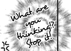
I am beginner i just don't know how to make a texts to be like these?


can anyone teach me how? i am using photoshop... please.. somebody please.. teach me how.. to make those text into black while having a white background...
 

gnutte

Manga Editor
上級員 / Jyoukuuin / Sr. Member
Joined
Feb 3, 2006
Messages
289
Reaction score
170
Age
36
Gender
Male
Country
Sweden
Right-click on the layer containing the text and click blending options. To the left you should see something called stroke. There you can choose what color to use, the size of the stroke or whatever.
 

ddadain

Manga Editor
英雄メンバー / Eiyuu Menbaa / Hero Member
Joined
Jun 19, 2006
Messages
636
Reaction score
128
Gender
Male
Country
Hong Kong
usually, people don't put their <real> faces in their avatar... might get stalked, you never know...

anyways, welcome to the world of typesetting!

often times, we are under appreciated... but our work is essential...

basically, what we do is put the translation in the image so as to make it as NICE and PERFECT as possible. besides that, you often have to find fonts to use, if a font scheme is not yet in place. another thing is a typesetter should also have a very keen sense of emotions, so as to put emphasis on some words, change fonts from text box to text box, etc.

you need to keep in mind that too many fonts is bad. be professional, stick to 1-2 main fonts, and some special fonts for special speeches. you need to be distinct and unique. unlike any other aspect of *normal* Edited Manga, typesetting allows readers a view of the style of the typesetter. typesetting is an art. translation, editing and QCing is pretty straight forward, but typesetting sets apart a really good Edited Manga from the GODLIKE ones.

*when I say normal, it means just black and white. since I am the typesetter of Isane, we're not really normal per-say because our releases are in WONDROUS COLOR!

the best way to learn how to typeset is by looking at GOOD typesettings. I can recommend you looking at the past chapters of One Piece, done by RUSH, may they rest in piece. other things like Whatever's D.Gray-man chapters have a really nice font scheme and layout. and many others, exploration is the key. stealing good ideas is best! XD

lol, and... if you notice, I didn't use capitals for my first letters in a sentence, except if they start with I. Always mind the capitals!

~ blah blah

and, yup, that's how you do stroke as gnutte said... or just highlight, then go to stroke text. Atleast, mine does it like that, although I don't have a "normal" PSCS2. I've gotta get meself one of em CS3s >_>

dain
 
Last edited:

GGpX

Banned
英雄メンバー / Eiyuu Menbaa / Hero Member
Joined
Dec 2, 2005
Messages
985
Reaction score
580
Age
36
Gender
Male
Country
Canada
I'll answer your question and give you more info than you need.

First, the white lining around the words is called a Stroke.

Select the sentence you want to have a silver lining, then go in Layers -> Layer Styles -> Stroke... and a menu'll pop up. You select white stroke at 2-3 px big. Depending on the size of your text.

Second, to rotate it that way. A lot of typesetters just do ctrl+t (For Free Transform) and rotate it as they see fit and leave it like that. You know what?

IT'S WRONG!

Do NOT do that. It ruins the text and breaks the characters up.

The proper way of doing it? Very simple. Start off with ctrl+t (For Free Transform), then right click and select "Skew". This is very important. Using Skew to rotate will make the text look natural and good. Now, to rotate it with Skew, you need to move it using the corners of the "box" it shows you. And once you're done, you have rotated text and it looks good! o;

Third, I haven't seen the raw of anything, but my instincts are telling me the text is too big. I'd shrink that down by 1-2 px. to make it look better. Which reminds me of another point. Always use the raws to typeset and try to typeset according to what the original characters look like. If the original characters look bold, make your font in the page bold. If the font is normal, keep your text normal. And so on, and so forth.

I would also split the lines "What * Are you * thinking!? * Stop it!" instead. It makes the bubble look more round and pretty.

That's all I can think of ~ Enjoy.
 

gleine020104

Registered User
初心者/ Shoshinsha / Beginner
Joined
May 8, 2007
Messages
14
Reaction score
0
Gender
Female
wow! that is a really nice Tutorials :) Thank you Sir/ Maam for sharing your knowledge about Typesetting.. it is really a Help for me , as a beginner.

I will always keep that into my mind :)

Thank you again & God bless
 

sakura_uchiha

Manga Editor
中級員 / Chuukyuuin / Member
Joined
Jun 15, 2006
Messages
249
Reaction score
2
Age
33
Gender
Female
Country
Marine Headquarters
I'll answer your question and give you more info than you need.

First, the white lining around the words is called a Stroke.

Select the sentence you want to have a silver lining, then go in Layers -> Layer Styles -> Stroke... and a menu'll pop up. You select white stroke at 2-3 px big. Depending on the size of your text.

Second, to rotate it that way. A lot of typesetters just do ctrl+t (For Free Transform) and rotate it as they see fit and leave it like that. You know what?

IT'S WRONG!

Do NOT do that. It ruins the text and breaks the characters up.

The proper way of doing it? Very simple. Start off with ctrl+t (For Free Transform), then right click and select "Skew". This is very important. Using Skew to rotate will make the text look natural and good. Now, to rotate it with Skew, you need to move it using the corners of the "box" it shows you. And once you're done, you have rotated text and it looks good! o;

Third, I haven't seen the raw of anything, but my instincts are telling me the text is too big. I'd shrink that down by 1-2 px. to make it look better. Which reminds me of another point. Always use the raws to typeset and try to typeset according to what the original characters look like. If the original characters look bold, make your font in the page bold. If the font is normal, keep your text normal. And so on, and so forth.

I would also split the lines "What * Are you * thinking!? * Stop it!" instead. It makes the bubble look more round and pretty.

That's all I can think of ~ Enjoy.
Wow, now i learned something good. Thanks!
 
Top