- Joined
- Aug 20, 2007
- Messages
- 27,293
- Reaction score
- 15,166
- Gender
- Hidden
- Country
-


Re: Weekly Shonen Jump [2011] - Discussion and TOC Talk - Part 2
---------- Post added at 08:29 PM ---------- Previous post was at 08:25 PM ----------
I guess the unique series do shine a little brighter now, even some of the series from the late 90's/early 2000's look better by comparison. Early Naruto looks really dazzling by comparison. One Piece, Toriko, and Hunter x Hunter look even better now too, in my opinion.
Yotsuya Senpai definitely had unique art. Oumagadoki did to an extent. The human characters still looked a little typical of Jump, not as homogenized as most series. I was thinking a little more of series that debuted in 2010 and 2011, good or bad series from 2009 or older all seem to have unique art styles and character design. That includes mid-decade series such as Muhyo.The character designs of Oumagadoki and Yotsuya Senpai are pretty unique, in my opinion. Not a recent series, but Muhyo & Roji art style is awesome too.
---------- Post added at 08:29 PM ---------- Previous post was at 08:25 PM ----------
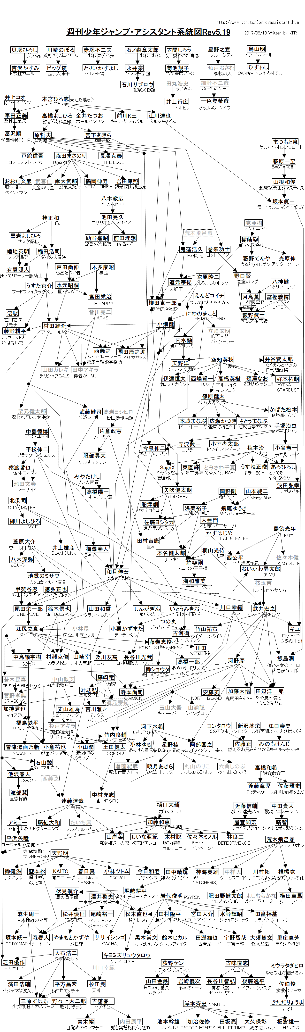
I wonder, since this was not the case even two years ago. As Inumaru pointed out, there have been exceptions, but as a rule there seems to be a more homogenous look to new Jump manga. Maybe the editors want a more unified look, or something like that :/Maybe most don't dare to create something more unique, maybe some were assistents to some running series, taking a bit of style because they know it works. Look at the bright side, the unique ones will shine even more brightly so. :P
I guess the unique series do shine a little brighter now, even some of the series from the late 90's/early 2000's look better by comparison. Early Naruto looks really dazzling by comparison. One Piece, Toriko, and Hunter x Hunter look even better now too, in my opinion.