Mag Talk Weekly Shonen Jump [2018] - Discussion and TOC Talk

Status
Not open for further replies.

Tamil

Registered User
有名人 / Yuumeijin / Celebrity
Joined
Apr 12, 2016
Messages
4,125
Reaction score
5,841
Country
Winterfell
Meh. Personally, and I know I am in the minority in this one, I really cant stand Part 4. It was annoying and boring to me. I've enjoyed Part 3 more, just because I liked the maincharacters(except with Jotaro).

I agree with @Gray Winter on this one, Part 6 and 7 are the best for me, too.That is also the reason why I want to see the Part 5 anime soon, just so we'll get closer to see my beloved Jolyne animated!
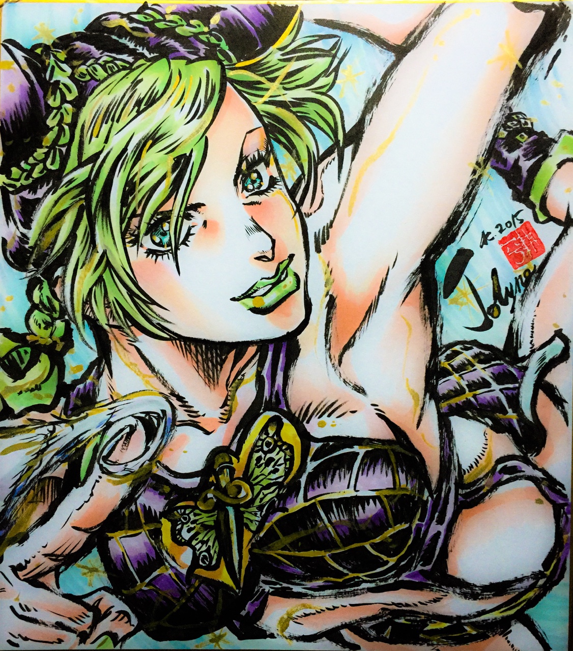
I like part 5 because it has some of all my fav characters and stands but I can totally understand your excitement for getting to see Jolyne animated. One of the staff members drew her
Yare yare dawa
 

TheEnhancedExe

Registered User
上級員 / Jyoukuuin / Sr. Member
Joined
Jun 28, 2017
Messages
281
Reaction score
344
Age
29
Country
Germany
Togashi has assistants.
Then I guess this is just a widespread rumour? Whenever Togashi returned from hiatus, people were talking about Togashi finally needing an assistant. Plus aren't assistants usually doing the backgrounds? HxH barely has any backgrounds in most of its panels.
I mean, from my point of view, both is possible. If it was clear that he has assistants, there wouldn't be any rumours unless people overlooked it. However the rumours can still be false and he has assistants he just never mentioned anywhere. I just took it for granted he has none because the majority of the fanbase did. Or I just remembered sth wrong, idk.
 

Belkac3m

Registered User
中級員 / Chuukyuuin / Member
Joined
Apr 1, 2018
Messages
164
Reaction score
185
Age
32
Country
Joker
Then I guess this is just a widespread rumour? Whenever Togashi returned from hiatus, people were talking about Togashi finally needing an assistant. Plus aren't assistants usually doing the backgrounds? HxH barely has any backgrounds in most of its panels.
I mean, from my point of view, both is possible. If it was clear that he has assistants, there wouldn't be any rumours unless people overlooked it. However the rumours can still be false and he has assistants he just never mentioned anywhere. I just took it for granted he has none because the majority of the fanbase did. Or I just remembered sth wrong, idk.
 

ChocoBar9

Registered User
有名人 / Yuumeijin / Celebrity
Joined
Jan 29, 2008
Messages
2,955
Reaction score
2,573
Gender
Male
Country
United States
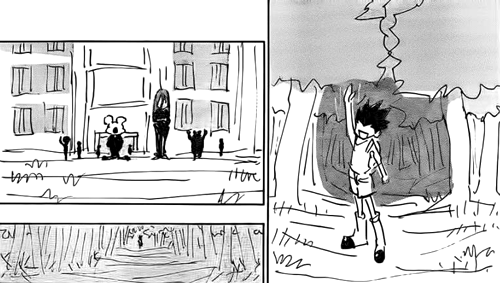
Yeah I ain't going to sugarcoat it Togashi's art is not good and has never been good. At its peak its okay at best. He frequently forgets how his characters are suppose to look, has really bad choreography, bad character designs and would literally turn in unfinished art because he's well aware that his fanbase doesn't care. What Togashi does have is good paneling, some crazy versatility in his penmanship and very creative layouts which shows more in HxH than YYH where he just got really lazy towards the end.
People have pointed out the art quality of current MHA has been lesser to an extent while the fight with Overhaul from the internship arc was hella messy and hard to follow. A weekly seralization like HxH so the same amount of time. I would not consider Togashi a more consistent artist than Hori.
That arc actually has he best art and paneling of the series thus far. You could really see Hori was struggling to make it every week but still had to put out something to compensate. Chapter 157 is a highpoint of the series. The current arc is largely just him taking it easy until the next big one since he learned not to overwork himself like last time.
 

Doughboy

Registered User
有名人 / Yuumeijin / Celebrity
Joined
Apr 1, 2016
Messages
4,482
Reaction score
8,341
Country
United States
That arc actually has he best art and paneling of the series thus far. You could really see Hori was struggling to make it every week but still had to put out something to compensate. Chapter 157 is a highpoint of the series. The current arc is largely just him taking it easy until the next big one since he learned not to overwork himself like last time.
Honestly I agree, it's cool for me however Jiro has looked off sometimes so I see clearly what people are referring to when the art quality looks off this arc but nothing dramatic. I already know what panel you're talking about but I wonder if his paneling is purposely made like this because of the superhero theme. This looks like something straight out of Spiderman comics but amazing regardless:


SharkBait

MH Senpai
伝説メンバー / Densetsu / Legendary Member
Joined
Aug 23, 2013
Messages
14,079
Reaction score
6,938
Gender
Male
Country
United States
I think Horikoshi just suffers with keeping the environmental models with debris and destruction from obscuring the character action, it made some of the close quarters fighting in that arc hard to follow, also it felt like he could have really giving some action moments more panels, it felt a bit condensed at times. Am curious if the print volumes will actually have more pages.
 

Belkac3m

Registered User
中級員 / Chuukyuuin / Member
Joined
Apr 1, 2018
Messages
164
Reaction score
185
Age
32
Country
Joker
Yeah I ain't going to sugarcoat it Togashi's art is not good and has never been good. At its peak its okay at best. He frequently forgets how his characters are suppose to look, has really bad choreography, bad character design
what do you call a good art ?
character design changes over years, it manga not a picture, it's his style, all the characters are recognizable despite the fact that the style changes, saying that he forget this is just a nonsense.
just look at character design of killua, leorio, kurapika, zoldyck familly, zodiacs, PT, the princes, the new characters such morena, wang and the mafia members, is that bad ? because they wear normal clothes ?
 

Mankichi Togawa

Registered User
MH中毒 / MH Chuudoku / MH Addicted
Joined
Jun 26, 2014
Messages
5,553
Reaction score
15,721
Gender
Male
Country
Spain
Honestly I agree, it's cool for me however Jiro has looked off sometimes so I see clearly what people are referring to when the art quality looks off this arc but nothing dramatic. I already know what panel you're talking about but I wonder if his paneling is purposely made like this because of the superhero theme. This looks like something straight out of Spiderman comics but amazing regardless:

That panneling was truly awesome.

I feel Horikoshi art quality has dropped last year, and I think reason is poor man gets tired easily and sometimes can't keep up. Remember how he had to take some rest weeks? (And it happened during S2 airing, so I expect something similar in S3).

Still, that doesn't stop him from create some epic moments like this one.
 

ChocoBar9

Registered User
有名人 / Yuumeijin / Celebrity
Joined
Jan 29, 2008
Messages
2,955
Reaction score
2,573
Gender
Male
Country
United States
what do you call a good art ?
Not this.
character design changes over years, it manga not a picture, it's his style, all the characters are recognizable despite the fact that the style changes, saying that he forget this is just a nonsense.
What the hell are you talking about? Its not a style change he literally forgets what characters are suppose to look like hence why you have moments where a character would have a cartoony expression when its suppose to be serious or why Leerio has gone through several revisions throughout the course of the manga because he couldn't get his character design down. Its the reason why people were laughing at Meruem's design originally because it looked exactly like Cell.

just look at character design of killua, leorio, kurapika, zoldyck familly, zodiacs, PT, the princes, the new characters such morena, wang and the mafia members, is that bad ? because they wear normal clothes ?
The Zodiacs have the worst designs in the manga, the new characters also don't have anything particularly notable about them that make them stand out from since they're literally background characters. Kurapika is the only character that has remained consistent throughout the manga. There's a reason why people remember Oda's and Hori's character designs because they put a lot into them so they stand out while Togashi doesn't; Phlinks is just a guy in a tracksuit, Shalnark looks literally like Kurapika's childhood friend, Franklin is just Frankenstein (you get it?) and Bonolenov is just a mummy. That's it. They're very uninspired.
 

xAsum0x

Registered User
英雄メンバー / Eiyuu Menbaa / Hero Member
Joined
Dec 4, 2014
Messages
1,763
Reaction score
1,582
Gender
Male
Country
United States
That panneling was truly awesome.

I feel Horikoshi art quality has dropped last year, and I think reason is poor man gets tired easily and sometimes can't keep up. Remember how he had to take some rest weeks? (And it happened during S2 airing, so I expect something similar in S3).

Still, that doesn't stop him from create some epic moments like this one.
It hasn't though. I am MHAs certified #1 fanboy so I would know if this is true or not
 

ChocoBar9

Registered User
有名人 / Yuumeijin / Celebrity
Joined
Jan 29, 2008
Messages
2,955
Reaction score
2,573
Gender
Male
Country
United States
Honestly I agree, it's cool for me however Jiro has looked off sometimes so I see clearly what people are referring to when the art quality looks off this arc but nothing dramatic. I already know what panel you're talking about but I wonder if his paneling is purposely made like this because of the superhero theme. This looks like something straight out of Spiderman comics but amazing regardless:

And here's another cool little effect that people missed. Follow the bullet.
That panneling was truly awesome.

I feel Horikoshi art quality has dropped last year, and I think reason is poor man gets tired easily and sometimes can't keep up. Remember how he had to take some rest weeks? (And it happened during S2 airing, so I expect something similar in S3).

Still, that doesn't stop him from create some epic moments like this one.
Wouldn't say got worse but he definitely needed to compensate for his lack of health and being extra busy with promotions with the anime and other things. He himself realized this though.
 

Mankichi Togawa

Registered User
MH中毒 / MH Chuudoku / MH Addicted
Joined
Jun 26, 2014
Messages
5,553
Reaction score
15,721
Gender
Male
Country
Spain
It hasn't though.
Dunno, before Chisaki Arc, there were very lively environments (or landscapes, dunno what's the correct word in english right now), now almost always is all white and no landscapes. I understand that way is easier for Horikoshi to draw now and get less tired.
 

ChocoBar9

Registered User
有名人 / Yuumeijin / Celebrity
Joined
Jan 29, 2008
Messages
2,955
Reaction score
2,573
Gender
Male
Country
United States
Black Clover art is really consistent (and yes, I remember what happened in last chapter)
BC's art is consistently mediocre. Tabata's character designs are just ugly.
 

Mankichi Togawa

Registered User
MH中毒 / MH Chuudoku / MH Addicted
Joined
Jun 26, 2014
Messages
5,553
Reaction score
15,721
Gender
Male
Country
Spain
BC's art is consistently mediocre. Tabata's character designs are just ugly.
I like it. It usually is very detailed and beautiful for me.

Sharing one of my favorite pics :cheez
 

SharkBait

MH Senpai
伝説メンバー / Densetsu / Legendary Member
Joined
Aug 23, 2013
Messages
14,079
Reaction score
6,938
Gender
Male
Country
United States
BC's art is consistently mediocre. Tabata's character designs are just ugly.
Posting falsities and lies should be a bannable offense.

Where is an example of this mediocre art? All I see are gorgeous pages

This is not mediocre
 

Belkac3m

Registered User
中級員 / Chuukyuuin / Member
Joined
Apr 1, 2018
Messages
164
Reaction score
185
Age
32
Country
Joker
Not this.

What the hell are you talking about? Its not a style change he literally forgets what characters are suppose to look like hence why you have moments where a character would have a cartoony expression when its suppose to be serious or why Leerio has gone through several revisions throughout the course of the manga because he couldn't get his character design down. Its the reason why people were laughing at Meruem's design originally because it looked exactly like Cell.


The Zodiacs have the worst designs in the manga, the new characters also don't have anything particularly notable about them that make them stand out from since they're literally background characters. Kurapika is the only character that has remained consistent throughout the manga.
It's counter-productive, you chose a panel where he can't even drawing, if that isn't a good drawing so the actual chapters are goods :p
Just don't answer my question instead of answering it that childish way.

He can't forget how they supposed to look, he can change there appearance when he want to change his style. You want to say he can't draw serious expressions ? :confused: when he does it very well. "I want examples of these cartonny expressions while it suppose to be serious"

Zodiacs have good design, they are zodiacs, they look like zodiacs, and clothed like zodiacs.

I mentioned about the mafia, the bodyguards are supposed to be normals, with there suits. But he succeeded to give us different designs for each one.

You can dislike the style, some like to see super hero clothes and full of pockets, with hair in many colors, especially if they go with these clothes.
But you cant' say that it's bad if they are wearing what they are supposed to wear.

 

xAsum0x

Registered User
英雄メンバー / Eiyuu Menbaa / Hero Member
Joined
Dec 4, 2014
Messages
1,763
Reaction score
1,582
Gender
Male
Country
United States
Tabata got the same face syndrome going on
 

ChocoBar9

Registered User
有名人 / Yuumeijin / Celebrity
Joined
Jan 29, 2008
Messages
2,955
Reaction score
2,573
Gender
Male
Country
United States
Dunno, before Chisaki Arc, there were very lively environments (or landscapes, dunno what's the correct word in english right now), now almost always is all white and no landscapes. I understand that way is easier for Horikoshi to draw now and get less tired.
Ironically enough people's complaints about that art in that arc was the excessive debris making it difficult to make things out. Didn't really notice a distinct lack of backgrounds in that arc compared to now though.
I like it. It usually is very detailed and beautiful for me.

Sharing one of my favorite pics :cheez
That's a nice scene but in general the big problem with his designs is the way he draws noses are far too distracting and his panel and linework are fairly bland.
--- Double Post Merged, , Original Post Date: ---
It's counter-productive, you chose a panel where he can't even drawing, if that isn't a good drawing so the actual chapters are goods :p
Just don't answer my question instead of answering it that childish way.
Again what are you talking about? I'm pointing to you reasons why Togashi is not a good artist because he surely drew that entire chapter and your own means to defend him is that "it doesn't count"?

Since I can't even understand what the hell you're trying o say I'm just going to leave it like that. Word of advice you don't defend a bad drawing but saying "its suppose to look like that".
 

Belkac3m

Registered User
中級員 / Chuukyuuin / Member
Joined
Apr 1, 2018
Messages
164
Reaction score
185
Age
32
Country
Joker
--- Double Post Merged, , Original Post Date: ---

Again what are you talking about? I'm pointing to you reasons why Togashi is not a good artist because he surely drew that entire chapter and your own means to defend him is that "it doesn't count"?


Since I can't even understand what the hell you're trying o say I'm just going to leave it like that. Word of advice you don't defend a bad drawing but saying "its suppose to look like that".
Your reason is that he forget how characters looks like, I said it's impossible, all mangaka have models for their characters, he could draw with the same style if he want (he did it with yu yu hakusho and level E) but he like to uses another style (realistic, junji ito style, classic manga style,..), it's a strength and not a weakness, I said we can always recognize them, it's the idea behind this.
If you try to draw, you will understand that the difficulty is not to memorize how the characters look like but to know how to draw it in different positions from your imagination, the visual memory does the rest.
putting all this in the right proportions, from the perspective shadows is difficult, the rest is from your syle
 
Last edited:

ChocoBar9

Registered User
有名人 / Yuumeijin / Celebrity
Joined
Jan 29, 2008
Messages
2,955
Reaction score
2,573
Gender
Male
Country
United States
Your reason is that he forget how characters looks like, I said it's impossible, all mangaka have models for their characters, he could draw with the same style (he did it with yu yu hakusho and level e) but he like to uses another style (realistic, junji ito style, classic manga style,..), it's a strength and not a weakness, I said we can always recognize them, it's the idea behind this.
His style has remained the same since the 90's. YYH had a fluctuating art style throughout its run not really adhering to consistency but Togashi's mood. HxH does not have a consistent art style and hasn't since it began. You call it him switching styles on the fly I call it him forgetting how to draw his characters hence why Gon went through several different size alterations throughout that arc and it took the anime to finally get him on model.
 
Status
Not open for further replies.
Top