How did I do cleaning? (Tsurebito) | MangaHelpers


  • Join in and nominate your favorite shows of the summer season 2023!

How did I do cleaning? (Tsurebito)

mwsmws22

Registered User
初心者/ Shoshinsha / Beginner
Joined
Oct 28, 2016
Messages
16
Reaction score
3
Age
37
Country
United States
I've been editing manga for awhile, but this is the first time I've scanned and cleaned myself.
After toying with settings/plugins for a long time, this is the best that I have gotten it.
If there is anyway to improve, I'd be grateful to know.

I wish I could get the screentones smoother, but I don't know how without losing detail from blur.
And example 3 gets grainy/blurry when the tone fades to dark at the top...


Also, the manga is Tsurebito, if anyone was curious.
 
Last edited:

Mana Light

Registered User
下級員 / Kakyuuin / Jr. Member
Joined
Dec 2, 2014
Messages
50
Reaction score
20
Gender
Male
Country
Vietnam
you should level again after denoise at final size. like 5 1 250.


what setting of sharp tool do you use? radius should be <= 3. you can see there is white pixel near black line that make cleans look bad. denoise with reduce blur can cause that but in your case i think it is because of sharpening.

you should use final size as 1200 px or 1300 px with topaz clean. you can read more about topaz clean (setting for it or topaz ring) here.
http://forums.sensescans.com/index.php?topic=2814.0
smaller cleans will looks better this case.

my cleans


I choose 1200 px without topaz clean but you maybe have to use it. for 1300-1400 px, it is needed to use TC with texture < 1. with 1200 px, don't need to lower texture setting.

Good thing that you scanned at 600 dpi. If you use sharp and topaz to clean, raws have to be scanned at 600 dpi for tank raws. Also you should upload original raws and psd for cleans (with 2 layers: raw as background and clean above). imgur will reduce quality of image iirc.
 

mwsmws22

Registered User
初心者/ Shoshinsha / Beginner
Joined
Oct 28, 2016
Messages
16
Reaction score
3
Age
37
Country
United States
I was trying to smooth/blur the screentones, because i like that look better. In both of ours you can see the moire patterns quite clearly. this is where i got stuck. because if i do that, then i lose detail on the rest of the image.

What i basically did for this batch was follow this tutorial, http://forums.sensescans.com/index.php?topic=2813.0
the one at the bottom titled " basic method for cleaning tankoubon/volume scans."
Very similar to what you did i think.

Then i tried something experimental, which i don't think worked as well as i hoped...

1. duplicated the layer (the basic cleaned version like yours)
2. descreened that layer so the screentone was smooth
3. set the descreened layer to 65% opacity over top the original cleaned layer
4. merge
5. Denoise with high detail recovery

and the results you see... there was a bit of an improvement, but nothing close to what i was going for.

here are some examples i really like

all of these have really smooth screentones and maintain a high level of detail, although the methods are a bit different for each.
This is what i wish i could get mine to look like...

also, I included a link to the full resolution raws and cleans in my original post.

Thanks for the help and speedy reply!
- mwsmws22
 

Mana Light

Registered User
下級員 / Kakyuuin / Jr. Member
Joined
Dec 2, 2014
Messages
50
Reaction score
20
Gender
Male
Country
Vietnam
http://img.bato.to/comics/2016/03/29/a/read56f9dad6d6591/img000010.png
http://img.bato.to/comics/2016/08/31/y/read57c7403a43eba/img000008.png

theye are digital version of manga. they are not cleans from scan at all. this is why they have details.

topaz clean with really lower texture setting cause losing screentones (and make cleans look like shit too so I don't recommend)
with final size 1200 px (<= 1400 for this manga) you can topaz clean one time with texure <= 0.3 to get rid of screentones but problem will appear:
gradient. gradient will look really bad. (this manga maybe doesn't have much gradient though)


The above page, gradient is really bad. I can fix it though.
But I have to say cleans with really low texture is very wrong. It looks really bad.

Anyways, you can't get rid of screentones at high size, you have to resize down to make dots merge together so that topaz clean can has effect. And topaz clean can get rif of it but it still cause losing details and make cleans look bad. So the answer is no. You can't reach what you wish. I have cleaned for 6 years but I don't see any of them. Cleaning should be with logic so we can know what is possible or impossible. In case you still want to try, keep in mind clean with logic, because what you want maybe don't exist. Trying to clean bindly doesn't change the fact. I don't know anything other than topaz clean and the result is not good. Well, I am not tell you what you "must" do but it is from my experience.

Read more about screentones here.
https://mangahelpers.com/forum/threads/screentone-removal-using-photoshop-batch-actions.3006022/
 

mwsmws22

Registered User
初心者/ Shoshinsha / Beginner
Joined
Oct 28, 2016
Messages
16
Reaction score
3
Age
37
Country
United States
Thanks for the advice. I really appreciate it.

While I may personally like the look of low texture screentones, I understand what you're saying completely. After much trial and error, it really does seem like its impossible to have both detail, and low texture. Guess I'll just have to accept it. Good to know.

I think I'm going to pivot my strategy then.

I've used a Topaz a ton, but my main issue with it is that its always obvious... especially with the screentones. I don't mind texture, as long as it's consistent. With Topaz, some areas look great, and others do not. This is tedious to correct and honestly annoying (to me), even when done correctly. I definitely see the appeal and will continue to use it, but I'm gonna try a different approach. That's just me.

On that note, I really like the style of this one.
The texture doesn't stand out much and the blacks are very sharp and clear.
I think it might have been descreened as well. I don't know...

I took a quick stab at it... but it needs work for sure.
obviously there is noise in the blacks and whites.
But my main issue is just getting it as smooth. hmmm....

I'm gonna toy around with descreen and blur. See what I can do.
I'll post what I got when I finish.

Thanks again for your help. I'm not really connected with any big scan groups or online communities, so this site is a great resource.
- mwsmws22


--- Double Post Merged, , Original Post Date: ---
Gaussian Blur + Sharpen Edges actually came out pretty well in my opinion.
 

Mana Light

Registered User
下級員 / Kakyuuin / Jr. Member
Joined
Dec 2, 2014
Messages
50
Reaction score
20
Gender
Male
Country
Vietnam
It is digital. It is not cleans from scan at all.
http://img.bato.to/comics/2016/07/24/h/read57953b706649c/img000013.jpg
There are many kind of digital, not all of them are good but most are good. Maybe i'll write about it another time. You can notice there is no cleaning error (pattern looks good) and every image has same size (width and height), it means it is digital.

imo, it is not good at all.
http://i.imgur.com/NCuJCI6.jpg
___________
Yeah. There are 2 ways to go: clean with topaz and without topaz. I intended not to say about cleaning without topaz because it is pain to write more lol.
-Don't clean with topaz
Topaz always cause lost details. So don't use it. You can sharp it a bit and use blur > surface blur in big size so that it will be easier to level. (sharp make dots bolder so it will be harder to lose when leveling. blur to make black matter is easier to level).

There is a hybrid way that I used for 300 dpi tank raws.
I use denoise but only use it indirectly. It makes black matter is easier to level and dots is better a bit. still use sharp in big size to keep dots when leveling and don't use blur (because blur will harm dots).

I called it complement pattern.

Repeat those steps several times.
Definition of "Complement Pattern" is denoise then darken layer. (but you have to level white before darken to not make original layer blur ).

The pure way to clean tank raws is just resize to big size like 8000 px high then blur > surface blur (optional) then level raws then resize down to final size. Don't use sharp tool at all so be caution when using sharp tool. Radius should be around 1.

- Cleaning with topaz. In your case it won't be much trouble to clean with topaz. But for other tank, it may be difficult.
It depends on dots/screentones manga has.
For example, page 1, dots are far from each other but in page 2, panel 1, dots (in black matter) are closer to each other. If dots are close to each other, it will be hard to keep it. It will be lost after using filter like denoise or leveling.
Scan tank at 600 dpi is for that purpose too. It is not like we scan 600 dpi instead 300 because we like it. It is because it is better.

Pattern looks bad. To make pattern smooth, we have to denoise it. It is unavoidable.

In brief, you can clean with sharp + topaz denoise + topaz clean with texture 0.6-0.8 (at final size) for this kind of raws but be careful, don't over denoise it.
Like I said, you should change sharp setting + use small size like 1200-1400 px + use topaz clean. With 1200 px high, don't need to lower texture (recommend it).
You also can clean with hybrid way.

Actually I don't know to level raws purely. We need to level black matter and white matter separately. And, I see some cleaners have their own ways to deal with tank raws. Sense scans is one of them. But I don't like their ways.
I chose topaz way for tank raws. And it is pretty different from normal topaz way. I even don't have to use topaz clean. only a bit if it is needed. for other cleaner, it is must when cleaning with topaz way.
https://puu.sh/rYOal/0ce2d84c91.png
https://puu.sh/rYO9g/137d10dbed.png
This is the best I can do. But still, really small black lines were lost with this kind of cleaning way.
 
Last edited:

mwsmws22

Registered User
初心者/ Shoshinsha / Beginner
Joined
Oct 28, 2016
Messages
16
Reaction score
3
Age
37
Country
United States
Mana Light said:
It is digital. It is not cleans from scan at all.
Wow, im dumb...
Mana Light said:
imo, it is not good at all.
Yeah, it is not very good looking back at it after a good night's sleep.

That being said i really liked the hybrid method. I prefer it because it maintains detail compared to Topaz.

For the example you did, how exactly did you do it? I'm trying to replicate.

I'm assuming you started off with the raw in the original post.
Did you level it first, at the original size?
Or did you reduce the size and then use the Complement Pattern?
How many times did you use the Complement pattern?
You set the levels layer to darken, right?

Thanks for putting up with my questions,
- mwsmws22
 

Mana Light

Registered User
下級員 / Kakyuuin / Jr. Member
Joined
Dec 2, 2014
Messages
50
Reaction score
20
Gender
Male
Country
Vietnam
"I'm assuming you started off with the raw in the original post."
Yes.

"Did you level it first, at the original size?"
Yeah, at original size, because resize will make image blurry, the effect will be less (and we don't use sharp tool at this size) so 300 dpi or 600 dpi, do at original size.
Don't level it first.
Actually, it depends on raw. We can level slightly (or even adjust brightness -50 then complement, after that adjust brightness 50) in order to complement can have its effect.
For example, if page is too dark (because of scan setting), complement will cause losing many details in black matter so lv a bit to make it brighter a bit.
If page is too bright (because of scan setting), level slightly to make it darker or adjust brightness.
Coplement is actually denoise, so you can see if denoise was done well or not. Level slightly here is just for denoising to be done better.
For this raws, don't need to level it first. Level it slightly don't make it worse either.

"Or did you reduce the size and then use the Complement Pattern?"
No. And if we resized, we would only resize it up.

"How many times did you use the Complement pattern?"
It depends. You need to test to figure what is better.
2 times: https://puu.sh/s08l8/84791fab1d.png
4 times: https://puu.sh/s08q6/f779cf036d.png

Do it 4 times, pattern maybe is better after leveling compare to 2 times but details in black matter is also lost a bit.
Be careful to not overlevel for black too. Maybe I overused a bit for 2 times one too. (or it is because 4 times will be easier to level black. anyways need to be careful).

"You set the levels layer to darken, right?"
No. Layer that was denoised will be darken then merge with original layer.
Duplicate layer raw then

Layer that was denoised will be darken then merge with dupicate layer from original layer.

Adjust original raw layer like slighty level or adjust brightness. (It is optional. Normally don't need to do it) >> Dupicate layer >> Complement 2-4 times. (It depends on kind of raws and what we adjust before complement. For my raws, it is usually 4 but yours maybe are 2 times. Do it more times, pattern maybe is better after leveling compare to less times one but details in black matter is also lost a bit.) >> Resize bigger like 8000 px high or 10000 px high >> Sharp tool: smart sharp or sharp > unsharp mask,.. (with radius ~1) , don't use sharp tools that don't have sharp setting >> Level >> Resize final size.

Complement pattern makes black matter is easier to level. It also cause losing details in black matter a bit and cause losing white dust in screentones a bit, but it also make pattern/screentones improve a bit (this is why it is called complement).
I can do some small steps to make complement pattern only affect dark matter and don't affect pattern at all. But losing a bit of white dust in pattern/screentones or have a better a bit pattern/screentones, I choose better a bit pattern.
All effects here are from denoise. (But remember denoise then level white before darken in order to not make white matter of original layer blurry).
 
Last edited:

mwsmws22

Registered User
初心者/ Shoshinsha / Beginner
Joined
Oct 28, 2016
Messages
16
Reaction score
3
Age
37
Country
United States
I tried to follow your description, but mine doesn't look as good as yours.


What do you think? How'd I do?

Also, this is 4 times Complement.
--- Double Post Merged, , Original Post Date: ---

i tried adding a descreen... but i don't think it made much of a difference

i'm gonna sleep now. thanks
 

Mana Light

Registered User
下級員 / Kakyuuin / Jr. Member
Joined
Dec 2, 2014
Messages
50
Reaction score
20
Gender
Male
Country
Vietnam
Yours is good enough. The different maybe is I sharped more than you. Actually, sharp tool will harm gradient so more sharp doesn't mean it is better. Although sharp will harm gradient, we still use it so level can be easier.

But it is not only thing that make different.
Did you also denoise it directly? Because yours is a bit blurry.

imo descreen made it worse.
 
Last edited:

mwsmws22

Registered User
初心者/ Shoshinsha / Beginner
Joined
Oct 28, 2016
Messages
16
Reaction score
3
Age
37
Country
United States
I just recorded the whole Complement process.
Maybe you can tell me where I messed up.

Thanks
 

Mana Light

Registered User
下級員 / Kakyuuin / Jr. Member
Joined
Dec 2, 2014
Messages
50
Reaction score
20
Gender
Male
Country
Vietnam
denoise 0.45
level 0 243
set current layer darken
merge down (ctrl+ E)

level directly after denoise by ctrl+L

for you,

denoise 0.45
Layer > New Adjustment Layer >>Levels... Enter 0 243
merge down (ctrl+ E)
set current layer darken
merge down (ctrl+ E)

You must merge "level 243"-layer before darken.
You can recored complement as action so clean can be faster.
Aso, after action was recorded. You can put box in the left by tick in the blank.

So when action was played to that step, you can modify it, for example Level in big size,
 
Last edited:

Gradonil_Ral

Manga Editor
中級員 / Chuukyuuin / Member
Joined
Jun 4, 2008
Messages
170
Reaction score
63
Gender
Male
Country
Winterfell
Hey. I know Mana Light gave you a lot of pointers, and I don't really want to undercut any of it, but cleaners started using topaz denoise and topaz clean as a way of fixing damaged screentones created by poor print quality in magazine raws.
You have HQ tank raws. Try avoiding using topaz clean and use as little of topaz denoise as possible.

I realize you might've come across plenty of releases based on HQ tank raws that also used topaz denoise and topaz clean, making the pattern more uniform, etc., but that's only because the cleaners were used to cleaning magazines and didn't know better and/or were too lazy to put in just a little bit more effort to clean them properly.

I mean, what's the use of having HQ tank raws if you're gonna lose bunch of details to filters and size down the pages to 1200px high in the end?

~~
BTW - when you're using topaz denoise and/or topaz clean, you have to level a bit afterwards. Denoise/Clean blur out the dirt/noise, they don't remove it. That means it's still on the page, only across a bigger area, without contrasting edges.
Take a look at your release of chapter 19 on batoto, its white background creates nice contrast to the blurred out dirt that appears on the top of most of the pages (sometimes on more then just the top).
 

Mana Light

Registered User
下級員 / Kakyuuin / Jr. Member
Joined
Dec 2, 2014
Messages
50
Reaction score
20
Gender
Male
Country
Vietnam
"but that's only because the cleaners were used to cleaning magazines and didn't know better and/or were too lazy to put in just a little bit more effort to clean them properly."

What we call HQ raws only mean raws were scanned at high resolution. Although tank raws are better than mag raws and it doesn't have error like mag raws, dots in tank raws is still not really good.

Dots are not good in tank raws. It means I have to denoise it to fix it. If I denoise too less, pattern won't look good.
So what if I denoise with proper amount of denoise.
For most pages, it looks fine but look carefullly, in many pages, the amount of detail that were lost are considerable like hightlight, details in black matter. So even we denoise proper, it still causes losing details in a degree.
For this manga or most tank raws in general, it is possible to clean with topaz way because the amount of cases details are lost are not much. But there are still some cases, gradients/hightlight were lost and can be seen easily.
Dots in black matter are even more not good. We have to denoise to make them arrange evenly but by that dots will be lost too. It means I can't denoise less for it and must denoise average. So how much carefully doens't matter. It doesn't change the fact the amount of denoise is still considerable.
So what called "didn't know better and/or were too lazy to put in just a little bit more effort to clean them properly" doesn't make senses.
The result is still not good. I got what Gradonil_Ral wants to say. Newbie tends to denoise even more than needed. But since the result mwsmws22 posted here still have details so I don't warn about it.

Moreover, for some manga, it seem to be impossible to clean with topaz way. Normally, tank version was printed very lighter compare to mag version.


if I zoom tank ver, i still can see it.

But for some tank, the color of is even more lighter especially black line.
With big black line we sill can sharp it but with smaller black line, we can't sharp it because the color is too light so sharp tool can't make it bolder like normal.
Dots in tank raws is not perfect. It needs to denoise even it is a really small denoise. In the end, smaller black line will be lost. (because it can't not sharpened beforehand).
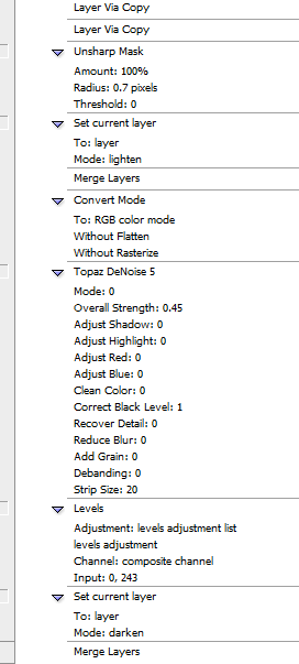
It means we mustn't denoise it directly. However dots are not perfect. Especially dots in black matter, it will look horrible. So we have to denoise to make it better. It means we need to denoise then darken. (level denoised layer whiter before darken)

In brief, with those tank raws that can't be sharpened like normal raws (were printed with very light color), normal cleaning way with topaz doesn't bring good result how much effort I gave. Like a year.
Anyways, tank raws are acually hard to clean "properly". If you accept to lose details in some degree, here you go.

About topaz clean, if you use final size like 1300 px or 1400 px for this manga, you should use topaz clean with texture < 1 and read about topaz clean tring in sense guide. It also will tell you have to level a bit again after topaz clean.
And using it is a must at size 1300 px or 1400 px, for this manga 1200 px doesn't require lower texture though.
Still keep threshold setting is 0.45, strength 2. if gradient looks bad for some pages like panel 1 page 3, you can duplicate layer then topaz clean with bigger threshold and select area then copy, move about topaz clean less one then merge. yeah combine good parts from 2 layers.
Large size doesn't need TC but for small size it is must.

For me, almost don't need to use TC.it is because my cleaning way are total different from normal topaz way. Don't denoise it both directly and indirectly. Now I notice it is similar to compelement pattern in the core.
http://puu.sh/s57Qi/8fc1deb6d4.png
http://puu.sh/s58Yy/9960d576ee.png

(another version here: http://puu.sh/s4ZxN/f654b8f145.png / http://puu.sh/s4Zym/e97641b8ea.png
they are bad. black line was lost due to sharp.)

Just create that action today. It still has a critical error. However it met one of my hopes, it is the end for me to find how to clean.

Forgot this, SAO Alicization manga in degenki bunko and SAO spinoff in SAO magazine have great quality due to quality of paper. Even more better than tank, but still, even when raws are good, it is not easy to clean. Because if we denoise, even slightly denoise, details will be lost.
 
Last edited:

mwsmws22

Registered User
初心者/ Shoshinsha / Beginner
Joined
Oct 28, 2016
Messages
16
Reaction score
3
Age
37
Country
United States
Alright so i tried working without heavy topaz clean, following manalight's explanation on how to use complement. I found it work really well on the dark example I posted, but when its comes to lighter pages, there are these super annoying streaks across the page. Any idea how to avoid them?


Also, I've been playing around with a new strategy... how well does this work?

Thanks as usual,
- mwsmws22
 
Last edited:

Mana Light

Registered User
下級員 / Kakyuuin / Jr. Member
Joined
Dec 2, 2014
Messages
50
Reaction score
20
Gender
Male
Country
Vietnam
screentones looks fine in raws but if something looks wrong in cleans it means a filter caused it and we messed up. Normally it would be because of sharpen tool and denoise. (Yeah, sharpening at size < 4156 px always makes result look bad. Denoise should be only adjusting denoise bar. Don't adjust other bar: recover details, highlight. shadow,.. )
You can use my public setting or your setting if you see it can be better a bit.

Frist, complement is actually not perfect. when we sharp indirectly then denoise, the pattern/dots that were repaired are not evenly. In a specific area, the amount of pattern/dots that were repaired are more than another specific area. I means effect was not distributed evenly because of sharp actually doesn't work well (because dots in raws is not pefect).
But it is the the cause in this case. We don't use complement much anyways.

The reason is level filter. It looks like that after leveling right. Because the dots are not pefect so leveling will make the difference more visible. After resizing down to smaller size, the dots will close and stick to each other, creat screentones, and look bad.
To avoid that you should resize down to 2600 px high. right before dots merge to each other.
You can try with 2100, 2200, 2300, 2400, 2500 px. you can see it looks bad. So let final size >= 2600 px high.
For me, I will use 1600 px or 1700 px though. It is not too bad for me.
 

mwsmws22

Registered User
初心者/ Shoshinsha / Beginner
Joined
Oct 28, 2016
Messages
16
Reaction score
3
Age
37
Country
United States
I think this one came out pretty well. I used complement twice and then sized it down to 2600 like you said.

Thoughts?

--- Double Post Merged, , Original Post Date: ---
With 4 times complement:
 

Mana Light

Registered User
下級員 / Kakyuuin / Jr. Member
Joined
Dec 2, 2014
Messages
50
Reaction score
20
Gender
Male
Country
Vietnam
The below looks better. Don't know why the first has more dusts, maybe it is the cause.
The choice will be yours since you knew how to use it.
More complement will have better screen tones (too many will harm) but it will be not much different between 2 and 4.
Less complement will have more details in black matter but black matter is not too good for leveling.
Sharp tool actually harm gradient. More sharp seems better but actually not because will cause harm more gradient. But low sharp still harm gradient and be harder to level. So don't sharp too much or too less. (radius should be ~ 1)
So nothing is called good standard with this way so I can't tell.
___
If complement brings good result, you can do the same with topaz way. But for some tank raws, it still looks bad with both ways. I can't do it well anyways. Even after several years trying bindly and even logically after that, I still can't do it and have to give up. So should be happy with this.
 

mwsmws22

Registered User
初心者/ Shoshinsha / Beginner
Joined
Oct 28, 2016
Messages
16
Reaction score
3
Age
37
Country
United States
Any tips for removing the dust particles in the white? I can't level much more than I already have...
Is my only option to manually paint over them?
 

Gradonil_Ral

Manga Editor
中級員 / Chuukyuuin / Member
Joined
Jun 4, 2008
Messages
170
Reaction score
63
Gender
Male
Country
Winterfell
I usually use Dodge Tool for leftover dirt (on white). Burn tool for noise (white on black).

IIRC, settings for dodge were Range: Highlights, Exposure: 10-20%. Burn - Range: Shadows, Exposure: 15-30%

Always Dodge in Grayscale mode (otherwise you'll get artificial dirt where you brush). If you burn in RGB, more Exposure will be required.
Use a 100% hard brush.

If you don't have a tablet you might need more Exposure on both. Then again, you might skip burn/dodge and just draw white/black over the leftovers on an empty layer in that case. Nah, mistakes with dodge are less visible.

~~~~~~~~~~
BTW - the patterns are too sharp on this page. IMO.
 
Last edited:
Top