- Joined
- Feb 10, 2018
- Messages
- 1,955
- Reaction score
- 4,863
- Country
-

people assume there isn't one...??? Wut? Thought there wasn't one?
but the TOC from before already stated that there would be one

people assume there isn't one...??? Wut? Thought there wasn't one?
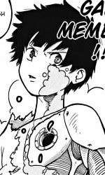

I really like... nay.. LOVE this!
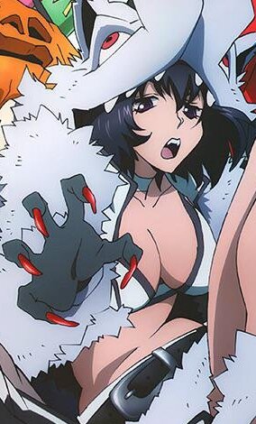

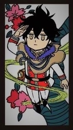


I'm shook anyway. But whatever, I like the color scheme of the villains and the gloves.but the TOC from before already stated that there would be one
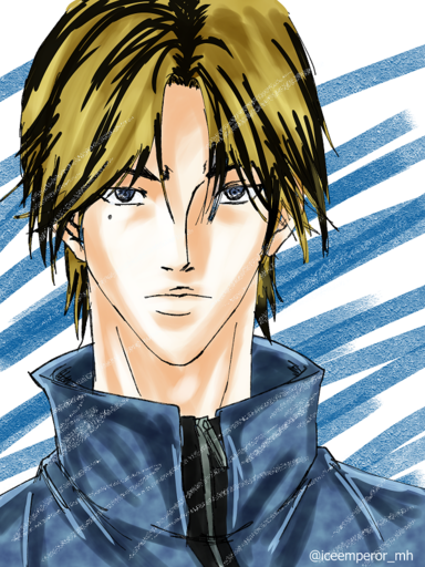

There's a brief synopsis on that page. It says "The stage flies to (is set basically) overseas to a "Giant Artificial moving city! The incident set between the end of term exam and the Forest Training camp arc is...!? A story of "another summer" that has yet to be told/written!" Its written as "Artificial" but the verb used before it is "float" so my speculation is a giant flying city. Its also basically canon.
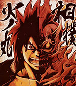

Well SnS sales have dropped and they're still giving it CP's & anime.Wonder if they'll ever stop pushing Boruto, sales have dropped while personally the content in both medias has been poor lately. It was some recent filler arc with the only highlight being Temari was involved for jonin business. The manga has been abysmal for awhile and the anime still isn't at the Momoshiki arc.

His early digital CPs were terrible but his later ones were fantasic. His colors got better in the manga's 2nd year giving us some wonderful spreads like the Heroes vs Villains Splash and the 2nd Popularity Poll Spread. I'm also mixed about his new analog coloring mostly because he had finally gotten the digital art down so well and decided to change it but this also looks good.Tbh unlike most I’m not a fan of Horikoshi’s non-digital CPs nowadays, but this one is totally dope.
Early Heroaca was most probably his first foray into digital. Both Zoo and Barrage were analog throughout. He most likely practiced in the time period between Barrage and Heroaca but even then he only got the full hang of it around the 2nd year. I personally prefer his analog because while there is a nice Marvel style to the digital ones, his analog colouring is actually rather interesting. I think it might be his shading but its personally much better.His early digital CPs were terrible but his later ones were fantasic. His colors got better in the manga's 2nd year giving us some wonderful spreads like the Heroes vs Villains Splash and the 2nd Popularity Poll Spread. I'm also mixed about his new analog coloring mostly because he had finally gotten the digital art down so well and decided to change it but this also looks good.
Yes its very obvious he was an amateur at it at the time because those early spreads and volume covers weren't the best. It kinda leads me to believe that he wasn't really confident in his coloring back then and why his CP count is pretty low in comparison to others. Fujimaki was a similar case. Hori does seem to prefer his analog over digital though which is good because I would really like an artbook of his works.Early Heroaca was most probably his first foray into digital. Both Zoo and Barrage were analog throughout. He most likely practiced in the time period between Barrage and Heroaca but even then he only got the full hang of it around the 2nd year. I personally prefer his analog because while there is a nice Marvel style to the digital ones, his analog colouring is actually rather interesting. I think it might be his shading but its personally much better.

>2 great CPs from MHA and Neverland
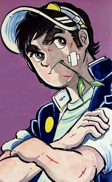

I'd say Masamori Morita (Rokudenashi, Rookies) or Masakazu Katsura (Wingman, Video Girl Ai, I"s). Mizuki Kawashita (Ichigo 100%) is also a contender for me.Random question time, who's the best artist in the history of Jump? Inoue or Murata no? I caught up to Tsugumomo recently and kinda amazed at what manga artists can do during fights (of course OPM already showed me dae wae). Too bad the mangakas on his Boichi shit.
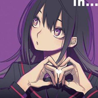

Emma is really cute in those clothes

I wonder how Togashi and Furudate made it on that list, but Horikoshi didn't. Don't get me wrong I like both HxH and Haikyuu, but I feel like the art is the weaker part of both, while Boku no Hero Academia has really strong art. Haven't read YYH, so I don't know if Togashi's artstyle used to be better back in the days.There was actually a poll about this last year in that regard.
http://www.animenewsnetwork.com/int...etizens-choose-jump-best-manga-artist/.115810
1.Takeshi Obata (Death Note)
2.Akira Toriyama (Dragon Ball)
3.Takehiko Inoue (Slam Dunk)
4.Tsukasa Hojo (City Hunter)
5.Hirohiko Araki (JoJo's Bizarre Adventure)
6.Masakazu Katsura (DNA²)
7.Eiichiro Oda (One Piece)
8.Hideaki Sorachi (GinTama)
9.Tetsuo Hara (Fist of the North Star)
10.Shun Saeki (Food Wars! Shokugeki no Soma)
11.Yusuke Murata (Eyeshield 21)
12.Kentaro Yabuki (To Love-Ru -Trouble-)
13.Masashi Kishimoto (Naruto)
14.Yoshihiro Togashi (Yu Yu Hakusho, Hunter X Hunter)
15.Tite Kubo (Bleach)
16.Akira Amano (Reborn!)
17.Osamu Akimoto (Kochikame)
18.Buichi Terasawa (Space Adventure Cobra)
19.Haruichi Furudate (Haikyu!!)
20.Katsura Hoshino (D.Gray-man)
Obata and Inoue are peerless and have done shit that are way above the standard of a Jump artist. I feel like Murata's prime weakness is that he's character designs are bland.

Probably because it is more recentI wonder how Togashi and Furudate made it on that list, but Horikoshi didn't. Don't get me wrong I like both HxH and Haikyuu, but I feel like the art is the weaker part of both, while Boku no Hero Academia has really strong art. Haven't read YYH, so I don't know if Togashi's artstyle used to be better back in the days.