All Purpose Sig Contest Discussion Thread 2011

Status
Not open for further replies.

Gintara

Artist
上級員 / Jyoukuuin / Sr. Member
Joined
Jul 28, 2007
Messages
417
Reaction score
386
Gender
Female
Country
United States
I see. Can't you duplicate the layer and place it or would that make it worse? I guess the sig's fine the way it is.

 

Shinsatsu

MH's Most Fashionable Member
有名人 / Yuumeijin / Celebrity
Joined
Dec 1, 2007
Messages
2,966
Reaction score
2,817
Age
38
Gender
Male
Country
Morocco
I see. Can't you duplicate the layer and place it or would that make it worse? I guess the sig's fine the way it is.
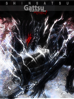
I tried that too :S
BTW, It's amazing that you noticed this flaw :D 'artist eyes' Doujutsu ^^

Anyway, that was the best outcome after so much struggle. In fact, that effect was the one that took most of the time I spent on the signature.
 

DeBaron8

Artist
英雄メンバー / Eiyuu Menbaa / Hero Member
Joined
Feb 3, 2010
Messages
551
Reaction score
571
Gender
Hidden
Country
Canada
@ Shin - I like the Katsumoto sig, but I think the Musashi sig is really awesome! :D The only thing that bugged me a bit was the color of the light source above his head. The bright white looked out of place to me, I think it needs some kinda of color tint in it. Nothing extreme, but just a little color (mabye red?), and then I think it would be perfect. It's seriously badass though, Vagabond is the next manga I want to read when I get the time.
 

~Coffee~

MH Senpai
英雄メンバー / Eiyuu Menbaa / Hero Member
Joined
Jan 30, 2010
Messages
1,129
Reaction score
1,014
Gender
Male
Country
United States
Gintara your Ao sig looks epic, I love the ones that have the water color paint feelings to them~
A little more texture to the overall would make it look better and yes the head sticks out a little too much~

Here are some more of mine, criticisms are helpful~
 

Shinsatsu

MH's Most Fashionable Member
有名人 / Yuumeijin / Celebrity
Joined
Dec 1, 2007
Messages
2,966
Reaction score
2,817
Age
38
Gender
Male
Country
Morocco
Goddamn that wolf guy banner looks awesome :P I feel proud.
@ Coffee:
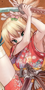
My Swords:
Cool background and nice effects :D Here's what I think:
- There are some areas that are a bit too sharp.
- The yellow effect in the top right doesn't go with the flow.
- The text is OK, but it can be improved for better results.

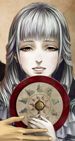
I Shall Draw:
Awesome render. the left part of the signature is perfect! the right part feels as if the brushing was made by an over-sized brush. It looks kinda blurry (I'm talking about the big green shape in the back).
+ Change the font.

I'm amazed by the fact that you can make awesome signatures with big canvases! I can't do that T_T
 

~Coffee~

MH Senpai
英雄メンバー / Eiyuu Menbaa / Hero Member
Joined
Jan 30, 2010
Messages
1,129
Reaction score
1,014
Gender
Male
Country
United States
Thank you!!!

Ill work on My Swords a little more

as for I shall Draw -
Im slightly confused as to what your talking about on the left side, the green is just a dark to light green gradient as the background with 3 uses of the pattern brush - maybe I just over blurred it???

*Goes to download yet more fonts
- Also, I seem to like working with larger areas more, I think I enjoy having more of a render in the sig with more of its details being shown, I think I would love making vertical sigs....


Shinsatsu

MH's Most Fashionable Member
有名人 / Yuumeijin / Celebrity
Joined
Dec 1, 2007
Messages
2,966
Reaction score
2,817
Age
38
Gender
Male
Country
Morocco
Just so you know "I shall Draw" Is a great signature and it can be used just as it is now (well, maybe after you change that font :P).
Maybe as you said, you over blurred the right part especially the character's hair and the little squares to the right.
 

DeBaron8

Artist
英雄メンバー / Eiyuu Menbaa / Hero Member
Joined
Feb 3, 2010
Messages
551
Reaction score
571
Gender
Hidden
Country
Canada
@Coffee - I like both your new sword sigs. I think the first one may have a bit too much going on though. It feels very busy. I like the second one better, but I'm not sure if I like it more than your first attempt at the theme. With the I Shall draw sig, the thing I don't like so much is the light section across the top on the girl's face. I think the light part works well for the sig, it just seems a bit too extreme on her face.

I forgot that I also had this old sig that I made for someone:
Is this one better than my current sig?
 

~Coffee~

MH Senpai
英雄メンバー / Eiyuu Menbaa / Hero Member
Joined
Jan 30, 2010
Messages
1,129
Reaction score
1,014
Gender
Male
Country
United States
@Debaron, the background effects of the ULQ sig of yours its pretty cool, but your current one has more of a overall feeling and a bit of depth to it~


Anyways - How are these, any better?
 
Last edited:

Tsukisama

MH Senpai
MH中毒 / MH Chuudoku / MH Addicted
Joined
Oct 15, 2007
Messages
6,247
Reaction score
2,771
Gender
Hidden
Country
United States

:confetti
The winner of the mother sig contest has been decided, and, of the three lovely submission, the winning submission belongs to ~Coffee~! :clap

"My Mommy" captured the essence of the theme through its focus on a mother and her small child. We see this strong image in the foreground and then reinforced through echoes of that image repeated to the left and right. The warm colors that dominate the background both accentuate the hair of mother and child and emote a nurturing feeling that the child is being bathed in the warm light of maternal love. The background has clean and simple shapes with lines that draw the viewer's eye across the signature and circles that soften the image and underscore the feminine aspect of the piece. The eye-catching text leads the user to the center of the signature in which there is a radiant heart blooming in the background behind the child, the perfect symbol for the affection of the ideal mother.

Given the title of the work and the obvious amount of love in this artwork, you let us all know how wonderful and caring your own mother must be, ~Coffee~. I am not sure if she has seen your work, but I would definitely encourage you to share this beautiful visual display with her, as it most clearly says, "Mommy, I love you!" :hug:luv

Congratulations and job most well done! :lovebunny
:confetti

Please be sure to share your own congratulatory sentiments with ~Coffee~ for his lovely victory.
​

There is only one week left on the sword theme. People were so enthusiastic about it at the onset. I hope we will be getting more entries in soon. :worrybunny
 

~Coffee~

MH Senpai
英雄メンバー / Eiyuu Menbaa / Hero Member
Joined
Jan 30, 2010
Messages
1,129
Reaction score
1,014
Gender
Male
Country
United States
T_T

Your writing skills never cease to amaze me Tsukisama, as you have brought me to tears today~
 

kakashi919

Registered User
英雄メンバー / Eiyuu Menbaa / Hero Member
Joined
Feb 14, 2009
Messages
2,311
Reaction score
1,988
Age
37
Gender
Male
Country
Trinidad and Tobago
Congrats Coffee~ :confetti
 

Zatono

MH Senpai
有名人 / Yuumeijin / Celebrity
Joined
Jul 6, 2009
Messages
3,940
Reaction score
1,649
Gender
Male
Country
United States
Congratulations, Coffee!
 

Shinsatsu

MH's Most Fashionable Member
有名人 / Yuumeijin / Celebrity
Joined
Dec 1, 2007
Messages
2,966
Reaction score
2,817
Age
38
Gender
Male
Country
Morocco
Congrats Coffee~ :D
 

DeBaron8

Artist
英雄メンバー / Eiyuu Menbaa / Hero Member
Joined
Feb 3, 2010
Messages
551
Reaction score
571
Gender
Hidden
Country
Canada
:confetti Congrats on the win Coffee!!! :confetti

PS - I like the first version of the updated I Shall Draw.
 

Zeltrax

Registered User
有名人 / Yuumeijin / Celebrity
Joined
Jan 30, 2009
Messages
3,138
Reaction score
1,583
Gender
Male
Country
Singapore
Late :sweatdrop but still Grats coffee :woo Nagisa..:wtf
Ushio :wtf
 
Status
Not open for further replies.
Top