Re: All Purpose Sig Contest Discussion Thread 2011
I saw that header the other day and was like, that looks like Coffee's work. Great job! I really like it.

About your shadow theme sig, I didn't comment yet, b/c I'm not sure which I like most. I like each for different reasons, so it's hard to pick the best one. The fire in the last two looks better than the first. I like the look of the blue in the last one in places, but then if compared to the first it seems that the render as lost some of its depth. So I'd say I like the left side and fire on the last two more, but that there may be too much effects on the centre of the render, b/c it should stand out more. I'm not sure if this makes sense even to myself, sorry.
Thanks to everyone for the feedback on my most recent sig, I've been busy this week, so I was trying not to post as much.
Btw, I have a new coloring, I still need to fix a few things, like some lines I should have deleted, but I posted it anyway. It's from Bleach even though I don't really like Bleach all that much anymore.
http://mangahelpers.com/forum/showthread.php?p=2268666#post2268666



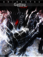


 I want to use a different character from everyone else for this one. I'm quite surprised noone has done a Shikamaru sig yet




 *working*





 seblees





 I'm lovin' it. Now that I've looked at more variations of that sig; I honestly prefer
  I don't know how to explain it. The render looks like it's about to disintegrate into pieces lol and you need to work on the spread of the blue glow!? ^^


 It was a simple request. Same as everybody else. The only difference; Far was already a Manga Editor and there is no subgroup for "Manga Editor/Artist of MH". So in the end your gallery was approved and you decided to keep the orange Manga Editor username. That's all. =P

 You wanna become a translator or something?