- Joined
- Jan 30, 2010
- Messages
- 1,129
- Reaction score
- 1,014
- Gender
- Male
- Country
-


anyways I think its time to go through some artists threads




I like the second the mostThe reason I ask this is because Im trying to decide which of my 3 favorites from this theme I should submit? Any suggestions?


 . It seems to be more creative and I like how the girl is "falling" or something. I'm not sure why, but I like the second one out of the three more. Anyway, wow, a lot of effort must have been made to make those three
Hello Bugzee!Zeltrax!!!
First of all; I'm so happy you've returned to this section.
Second of all: omg zomg omg that's one fricking awesome siggy~
Thirdly: zomg omg zomg omg we have another awesome contestant that can threathen Coffee's dominance in these contests! There is still hope.
<hr noshade size="1">
threaten* ><

 .
.


ITA, and thank you! I think that you're right, the meaning is also importantI like the idea of the sig. Like you said it is not typical, but it's good to be creative too. I've made some pretty unique sigs and tried a variety of strange things. Sometimes it's good to focus on the meaning you want to convey more than asthectics. I actually think your sig is quite good though.

That is..something I've never heard ofThe two things I'd change is the location of the text and the position of the render. I learned from Coffee and Shinsatsu that it's best to follow the rule of thirds. Try to position the focal point of the render (somewhere between Ichigo's and Rukia's head) and bit lower on the sig - 1/3rd the height of the sig from the top. You could also play with making the render a bit bigger and more close-up on their faces.
but then it seems to be interesting and helpful so I'll try that ! The render can't be bigger because of all the "memories" of them and it's hard to do a close up when it's not what I'm aiming for. However, I'll take that in mind, I really need more practice to improve my focal point 
It's not confusing, I'll keep this diagram in mind and try that possibilityAs for the text position. It should probably be on one side or the other of the render and should be lower as well. Try follow the rule of thirds again, but this may be difficult with how you have designed the sig. If you can envision this diagram as a sig, you want to position the focal points and text near the four central points where the vertical and horizontal lines cross, or at least along one of the lines. Someone else can probably explain it better, so please correct me if I made this really confusing.
l l l l
l l l l
---------------------------------------------------
l l l l
l l l l
---------------------------------------------------
l l l l
l l l l
. For this rukia and ichigo signature, I really don't have much choice to put the sig because of the spaces the "memories" are occupying. I think it might just be an excuse but I'll see to it that the next one will be somewhere around the lower left/right.True, I don't think I'm that good with that type of effect. Half the time I have no idea what I'm doing with that..But I wanted to add it to give something more to the signature.My advice is that the orbs should probably go. If you aren't that good with this type of effect it's best not to add it, but if you did want them still, try to make them more varied in size and brightness, because they look too uniform. Also try to make some bigger ones in the foreground that are sharper and some that are smaller and a little blured in the background. This will give the feeling of depth. I'm not so good with these types of effects so I usually never get it to look right and end up just taking them out. I use brushes sometimes, but they are the lazy way to get ok effects.

There's quite a lot of challenges huh..I think everyone fools around with sigs, turning layers on and off, until they get what they like. The thing that will change over time, is that you will have better judgement as to what others also will like, and that only matters if you want it to. But I still find that some sigs I just know what fits and looks good, whereas with others I really struggle to decide if something fits or not. I think this is just one of the challenges of sig making. PS - Picking and blending text is usually the hardest part.

It's okay, thank you for everything you postedWhoops my diagram did not work, when I posted it. Sorry.
!Whoa, nice one as usual, Shin! I can clearly see the focal pointTank you !
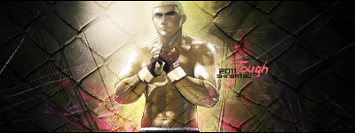
and once again the text blend in so well! I really like this. At first, I thought it's from Hajime no Ippo(because he's a boxer) but now I'm not sure..
I usually follow what it says in the first post about either closing the thread at about 11pm GMT or two weeks after I post the submissions thread. Since I always post the submissions thread after 11pm GMT, I usually close the submissions thread around the time I opened the submissions thread.Ok so first a question for Tsukisama - Is there usually a set time for when you close the submissions?(it doesn't seem like it, but just to be sure)
The reason I ask this is because Im trying to decide which of my 3 favorites from this theme I should submit? Any suggestions?



 (whoa! huge post lol).
 ), it will close in about an hour; so, good luck for those who want to slip in an entry at the last minute!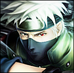


 Sorry about that, because I actually like it a lot. I think the chess board pattern of the pictures looks very nice and the render in the centre also works really well for this concept. I also like that the main render is colored and that the memories are in black in white, this was a great touch. I redid the rule of thirds thing as a proper image.
yeah, I totally agree with you, sig making is challenging, even having a good idea of what looks good and is typical for a good sig doesn't mean you can pull it off. This is my big problem, I can already see that like Bugzee and the others have said, you've just started and already have nice sigs so you have great potential.There's quite a lot of challenges huh..
It's definitely fun, for all skill levels, especially this competition when we get new themes every other week and have great discussions in this thread. I'm pretty boring, but the guys are all pretty darn funny and interesting.But I still like sig making
No problem^^ I like to offer feedback, I'm not sure if it's ever that useful, but I really appreciate all the advice I get, so I like to try to do the same for others as best I can.It's okay, thank you for everything you posted
Great theme but a hard one too.


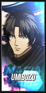


Awesome. If you still have the psd, change the text. Amazing sig dude. I really like the background.Made a random sig
~! Great job kakashi!


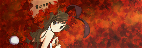
Ty allAwesome. If you still have the psd, change the text. Amazing sig dude. I really like the background.
I also wanted to change the text after I closed off everything lol



Boredom kills. I don't have anything to do -_- I'm really tired of waiting for Dragon Age II to be released... No good anime to watch... No entertaining manga to read... No exams either! what the hell !?Nice one, Shin!
hmmSeems as though you've mastered the art of using writing/text/fonts in your sigantures as well, Shin. I like the fact that you don't stick to the same font size/style. You switch it up everytime.
thank you. I still have a long way to go!!! + Messing up Coffee's signatures helps you improve alot :P maybe you should try that too ^^
Classic! I will, Shin! Don't you worry!I still have a long way to go!!! + Messing up Coffee's signatures helps you improve alot :P maybe you should try that too ^^
Right, Shin?
I didn't forgetSounds great! It would be awesome if we could work togetherShin dude! If there's ever another one of those "collaboration with another member" sig contest...would you be my partner?
The team is set xD.
Ok, best way to wait for Dragon Age II, replay the first one again.Boredom kills. I don't have anything to do -_- I'm really tired of waiting for Dragon Age II to be released... No good anime to watch... No entertaining manga to read... No exams either! what the hell !?
I've been doing that all week on my new 47" TV. I'm trying to get all the achievements since I already played through it 2 1/2 times. Now I'm playing as a girl for the first time, for some reason I always play as guys for the eye candy. What is the exact day it comes out? I know it's this month, I'mplanning on ordering it tomorrow.
I've been playing the first one this week ... Sadly, I already played the game several times... I tried all classes and had all achievements and also tried almost every possible senario :S which is bad because now I don't have anything new to do... I'm just creating a savegame to use it when I get II.