All Purpose Sig Contest Discussion Thread 2011

Status
Not open for further replies.

Shinsatsu

MH's Most Fashionable Member
有名人 / Yuumeijin / Celebrity
Joined
Dec 1, 2007
Messages
2,966
Reaction score
2,817
Age
38
Gender
Male
Country
Morocco
What do you mean by working on my text a little bit more :darn?
The text is an important part of the signature. It has to go with the aspects of the signature. Also, it shouldn't take over the focus of the person looking at the signature. IMO, the text is the hardest thing to learn in signatures :S

Nono, I don't think I've graduated just yet, there's still a lot to learn and there's already three errors here. Thanks for telling me what's wrong ;)!
Have faith in yourself! you are doing great :D
 

kakashi919

Registered User
英雄メンバー / Eiyuu Menbaa / Hero Member
Joined
Feb 14, 2009
Messages
2,311
Reaction score
1,988
Age
36
Gender
Male
Country
Trinidad and Tobago
I agree with shin... text is the hardest thing to get right :darn

About the sig... shin is right,it's a bit too bright and really does block a bit of the render. Other than that and the text, it's a great sig. Love the background and the colors. Good job. Much much better than I was when I started, and probably better than I am right now anyway :tem
 

~Coffee~

MH Senpai
英雄メンバー / Eiyuu Menbaa / Hero Member
Joined
Jan 30, 2010
Messages
1,129
Reaction score
1,014
Gender
Male
Country
United States
I like it Zeltrax~
I am a toaru fan as well!
 

Zeltrax

Registered User
有名人 / Yuumeijin / Celebrity
Joined
Jan 30, 2009
Messages
3,138
Reaction score
1,583
Gender
Male
Country
Singapore
I agree with shin... text is the hardest thing to get right :darn
I agree, all the signatures that Shin have seems to make sure that the text does not look out of place and fit in. Really tricky stuff and it's awesome how people manage to do it :tem

About the sig... shin is right,it's a bit too bright and really does block a bit of the render. Other than that and the text, it's a great sig. Love the background and the colors. Good job. Much much better than I was when I started, and probably better than I am right now anyway :tem
Thank you! I like how I did the colors too! I don't think I'm better than you was or you are right now but I'll keep trying to make new ones when I have time, best way is to practice :amuse

I like it Zeltrax~
I am a toaru fan as well!
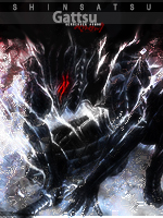
Thank you! Wow, I found a toaru fan..the only ones I know in this forum are Raikou and Jammin.. and the thread in the otaku theater is dead :darn. I'm really loving the new arc now and I would like you to know the words used from this signature came from this song

It's a track from the album of Index's second ending and I was putting this on repeat when doing this signature.
Songs really do help and gave me the "mood" for it :D
 

Zeltrax

Registered User
有名人 / Yuumeijin / Celebrity
Joined
Jan 30, 2009
Messages
3,138
Reaction score
1,583
Gender
Male
Country
Singapore
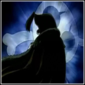
I'm sorry for getting ahead of myself :darn but here's another one that I made:


Tbh, this doesn't really look like a signature..All I did was find images of ichigo and rukia together, piece them together, made the glowing effect, and edit here and there :eyeroll . But anyway, I was talking about Ichigo and Rukia in a thread so I decided to go ahead and make one :amuse!

There's really no improvements and I'm sorry for asking so often but do you think it will be better without the light orbs, a question to come with that is everytime I'm making a signature, I can't come to a decision on how it should be..with/without something or adding/removing something..how do you guys cope with it?
 

Bugzee

MH Senpai
MH中毒 / MH Chuudoku / MH Addicted
Joined
May 17, 2009
Messages
8,407
Reaction score
5,223
Gender
Male
Country
United Kingdom
Zeltrax!!! :zomg

First of all; I'm so happy you've returned to this section. :zomg
Second of all: omg zomg omg that's one fricking awesome siggy~ :zomg
Thirdly: zomg omg zomg omg we have another awesome contestant that can threathen Coffee's dominance in these contests! There is still hope. :crying :shakefist


threaten* ><
 
Last edited:

DeBaron8

Artist
英雄メンバー / Eiyuu Menbaa / Hero Member
Joined
Feb 3, 2010
Messages
551
Reaction score
571
Gender
Hidden
Country
Canada
@ Zeltrax - I like the idea of the sig. Like you said it is not typical, but it's good to be creative too. I've made some pretty unique sigs and tried a variety of strange things. Sometimes it's good to focus on the meaning you want to convey more than asthectics. I actually think your sig is quite good though.

The two things I'd change is the location of the text and the position of the render. I learned from Coffee and Shinsatsu that it's best to follow the rule of thirds. Try to position the focal point of the render (somewhere between Ichigo's and Rukia's head) and bit lower on the sig - 1/3rd the height of the sig from the top. You could also play with making the render a bit bigger and more close-up on their faces.

As for the text position. It should probably be on one side or the other of the render and should be lower as well. Try follow the rule of thirds again, but this may be difficult with how you have designed the sig. If you can envision this diagram as a sig, you want to position the focal points and text near the four central points where the vertical and horizontal lines cross, or at least along one of the lines. Someone else can probably explain it better, so please correct me if I made this really confusing.

l l l l
l l l l
---------------------------------------------------
l l l l
l l l l
---------------------------------------------------
l l l l
l l l l

There's really no improvements and I'm sorry for asking so often but do you think it will be better without the light orbs,
My advice is that the orbs should probably go. If you aren't that good with this type of effect it's best not to add it, but if you did want them still, try to make them more varied in size and brightness, because they look too uniform. Also try to make some bigger ones in the foreground that are sharper and some that are smaller and a little blured in the background. This will give the feeling of depth. I'm not so good with these types of effects so I usually never get it to look right and end up just taking them out. I use brushes sometimes, but they are the lazy way to get ok effects.

a question to come with that is everytime I'm making a signature, I can't come to a decision on how it should be..with/without something or adding/removing something..how do you guys cope with it?
I think everyone fools around with sigs, turning layers on and off, until they get what they like. The thing that will change over time, is that you will have better judgement as to what others also will like, and that only matters if you want it to. But I still find that some sigs I just know what fits and looks good, whereas with others I really struggle to decide if something fits or not. I think this is just one of the challenges of sig making. PS - Picking and blending text is usually the hardest part.


Whoops my diagram did not work, when I posted it. Sorry.

 
Last edited:

DeBaron8

Artist
英雄メンバー / Eiyuu Menbaa / Hero Member
Joined
Feb 3, 2010
Messages
551
Reaction score
571
Gender
Hidden
Country
Canada
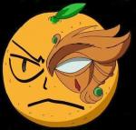
Tank you ! :D One more ? here you go :
I really like this one. :D Render, background, text, lighting. It all looks great! Your new ava is pretty sweet too.

I'm excited for the new theme. I've banned myself from coloring until I get some school work done, and it's hard not to. So for now, I'll continue to make sigs for the contest so I still have an artistic outlet.
 

~Coffee~

MH Senpai
英雄メンバー / Eiyuu Menbaa / Hero Member
Joined
Jan 30, 2010
Messages
1,129
Reaction score
1,014
Gender
Male
Country
United States
Ok so first a question for Tsukisama - Is there usually a set time for when you close the submissions?(it doesn't seem like it, but just to be sure)

The reason I ask this is because Im trying to decide which of my 3 favorites from this theme I should submit? Any suggestions?


~Coffee~

MH Senpai
英雄メンバー / Eiyuu Menbaa / Hero Member
Joined
Jan 30, 2010
Messages
1,129
Reaction score
1,014
Gender
Male
Country
United States
Now are you saying that so Ill turn in the worst one?
or are you being truthful?
XD
 

Bugzee

MH Senpai
MH中毒 / MH Chuudoku / MH Addicted
Joined
May 17, 2009
Messages
8,407
Reaction score
5,223
Gender
Male
Country
United Kingdom
I'm being truthful. :(

You're funny. You think I'm purposely misleading you or something? :XD
 

~Coffee~

MH Senpai
英雄メンバー / Eiyuu Menbaa / Hero Member
Joined
Jan 30, 2010
Messages
1,129
Reaction score
1,014
Gender
Male
Country
United States
Maybe, Lol~
Personally I would lean toward the 3rd, a friend I usually ask said he likes 2 the best, and you say 1. LOL I hate the different tastes~
 

Bugzee

MH Senpai
MH中毒 / MH Chuudoku / MH Addicted
Joined
May 17, 2009
Messages
8,407
Reaction score
5,223
Gender
Male
Country
United Kingdom
Flip a coin or something. :p

Choose which one YOU like the most. That's what I do sometimes anyway. It's better to choose the one you're most comfortable/happy with tbh. :)

I'm about to submit my one now~ I just need to gather up the links and whatnot. It's nothing special~ I honestly struggled with this render. ;_;
 

~Coffee~

MH Senpai
英雄メンバー / Eiyuu Menbaa / Hero Member
Joined
Jan 30, 2010
Messages
1,129
Reaction score
1,014
Gender
Male
Country
United States
It wasn't an easy render, the proportions weren't very good for a sig~
 

Bugzee

MH Senpai
MH中毒 / MH Chuudoku / MH Addicted
Joined
May 17, 2009
Messages
8,407
Reaction score
5,223
Gender
Male
Country
United Kingdom
Submitted my sig. I'm not terribly proud of it tbh.

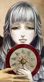
I initially wanted to incorporate the "7 deadly sins" theme with the render. I interpreted the render in several different ways but I felt that she had a pose and expression of one that needs to decide upon something. A decision, a choice, a fate....the right path maybe? xD

I didn't want to use and portray the 7 deadly sins in a conventional way...I wanted to mask/hide it over objects/things of nature....I honestly ran out of time. I played around with it so much that I got fed up lol. It would've been a cool concept to complete but it ended up becoming to confusing and messy for me.

Each sin has a "colour" and I wanted to represent that in the sig as well. The green thorns represent envy btw~ There are a few others. I'll let you decide them for yourself. ;) These sins weren't suppose to represent or indicate that the young lady had actually committed any of them...I wanted to make a visual perspective of her thoughts...arghhhh I had too much to think about and it all went pear shape XD! Oh well. I've definitely learnt a whole lot from this experience. So it's all good in the end. Good luck everyone!~~
 

DeBaron8

Artist
英雄メンバー / Eiyuu Menbaa / Hero Member
Joined
Feb 3, 2010
Messages
551
Reaction score
571
Gender
Hidden
Country
Canada
Maybe, Lol~
Personally I would lean toward the 3rd, a friend I usually ask said he likes 2 the best, and you say 1. LOL I hate the different tastes~
Yeah, it's funny how we all like different things. I'd say you made the right choice with submitting the first one. It would have been my choice out of the the three. However, I'd like the 2nd one the most, but only if it was vertical sig and rotated 90 degrees.

I'm really glad that so many people participated in this contest. I think we should do the same render thing again sometime. Although, I liked the render, I think we should all choose something easier to work with proportion wise, if there's a next time. :)
 
Status
Not open for further replies.
Top